Cari Cashback & Wallet: Final UX & Outcomes
A complete redesign of Cari’s wallet and cashback experience to reduce user confusion, streamline checkout, and improve reward redemption across the app.
My role: Led product design across UX, UI, information architecture, and interaction logic. Worked with product, engineering, and support teams to reshape the cashback model and reduce operational load.
PROBLEM
Users mixed up wallet funds and cashback, triggering wrong payments, drop-offs, and a high volume of support tickets.
SOLUTION
Introduced clearer balance types, transparent rules, guided redemption, and a simplified checkout logic that removed confusion and prevented misapplication.
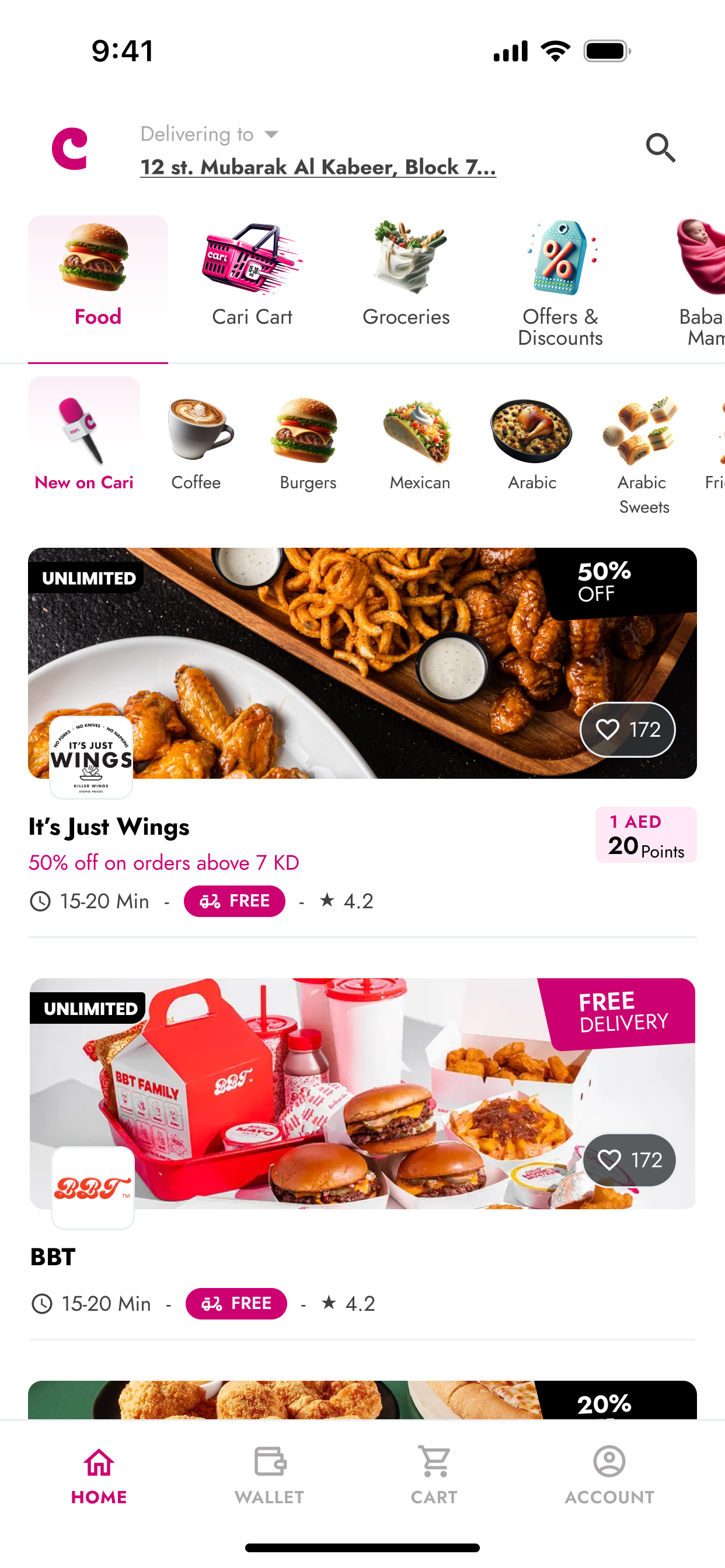
BEFORE
Cashback and promo codes appear identical, so users treat stored value like a discount and often apply the wrong option.
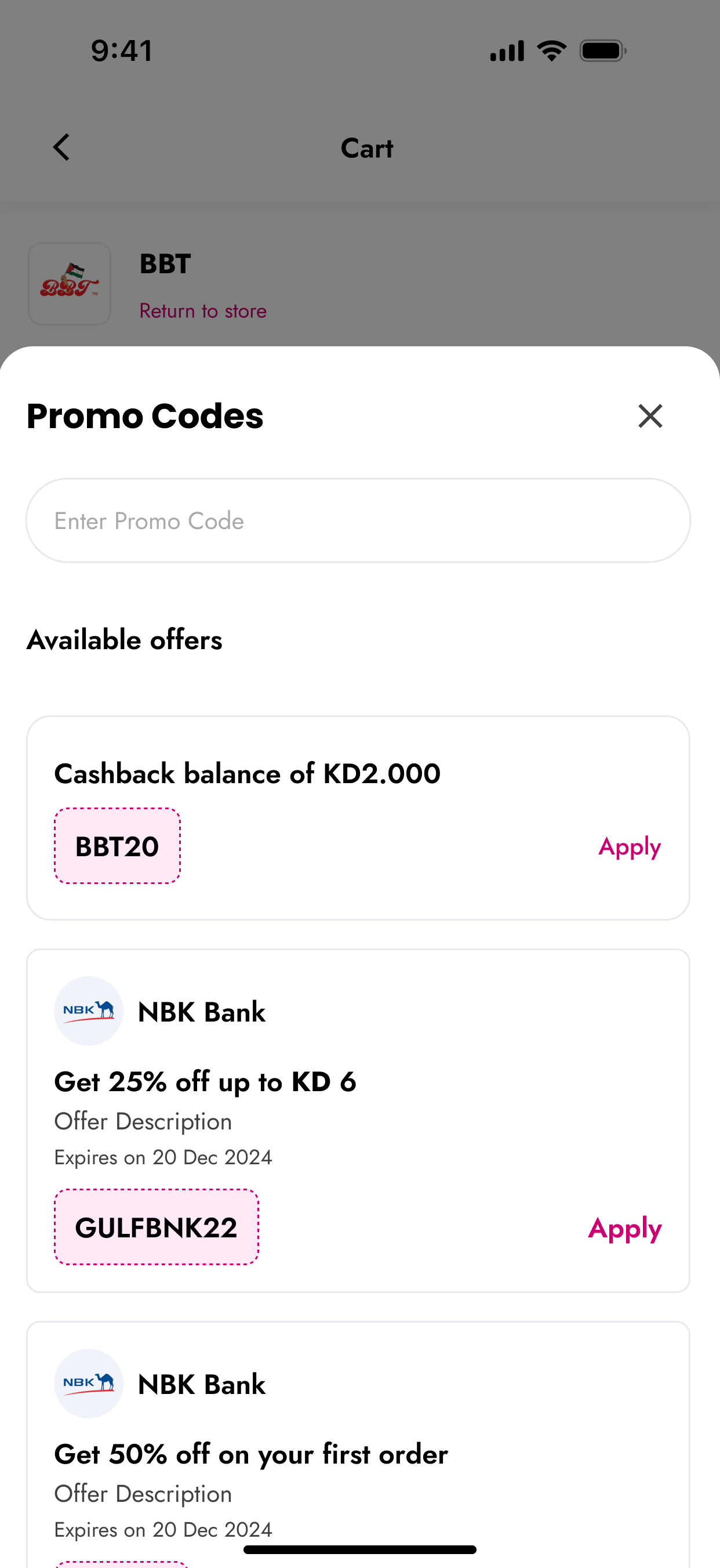
Cashback is shown as a promo code inside the offers list, reinforcing the wrong mental model and causing misapplication during checkout.
FINAL SCREENS
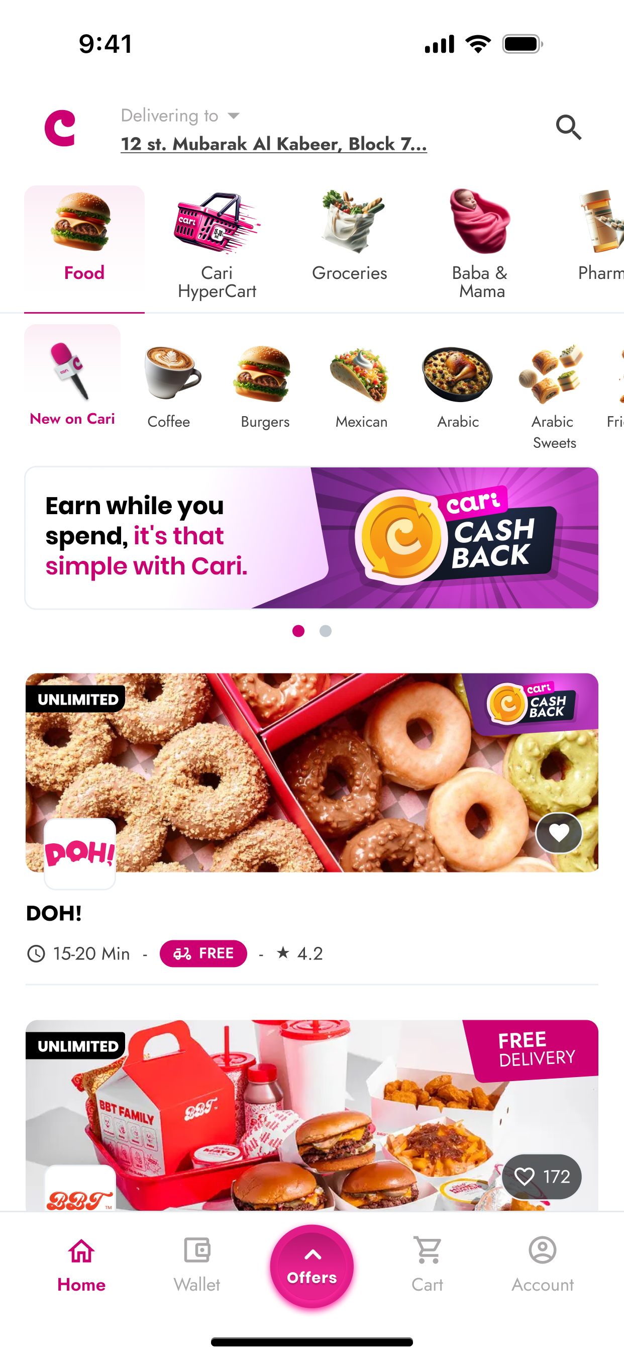
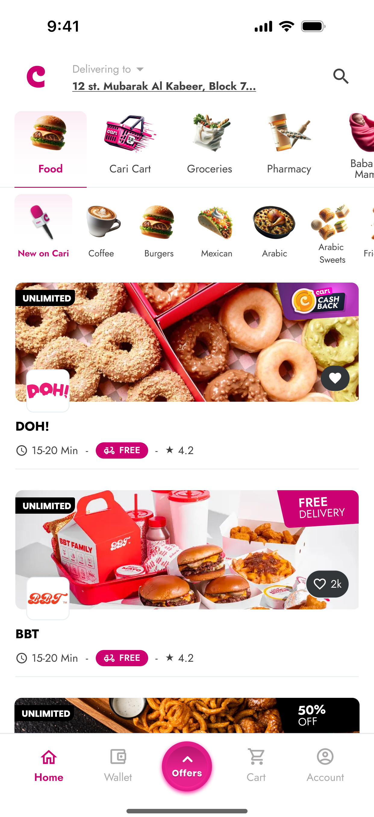
Clear cashback messaging on the home screen improves visibility and helps users understand reward opportunities upfront.
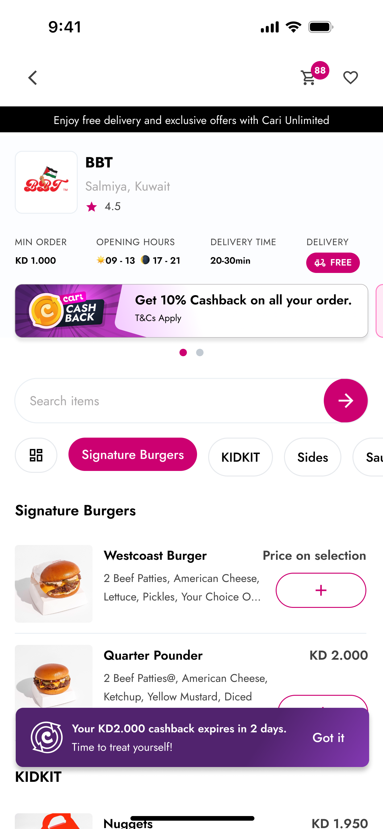
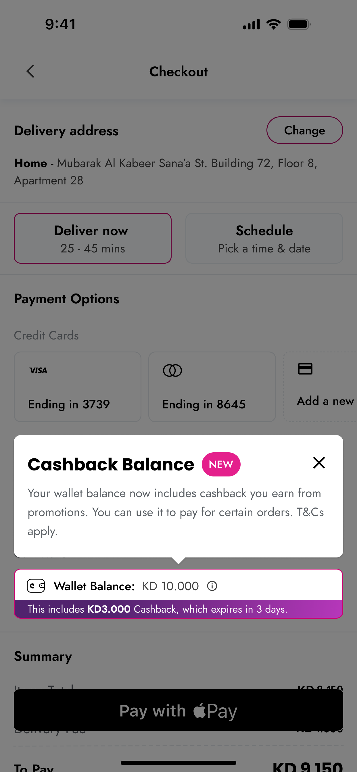
Transparent cashback reminders ensure users know their available rewards and expiry, reducing confusion during item selection.
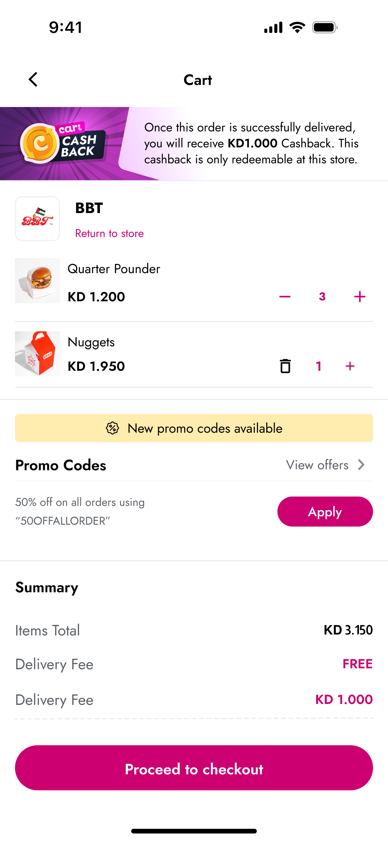
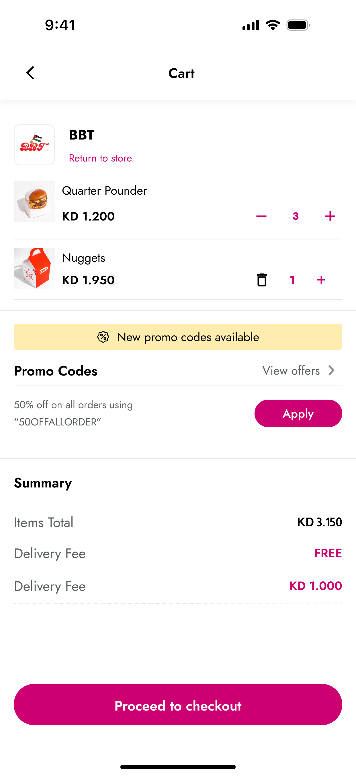
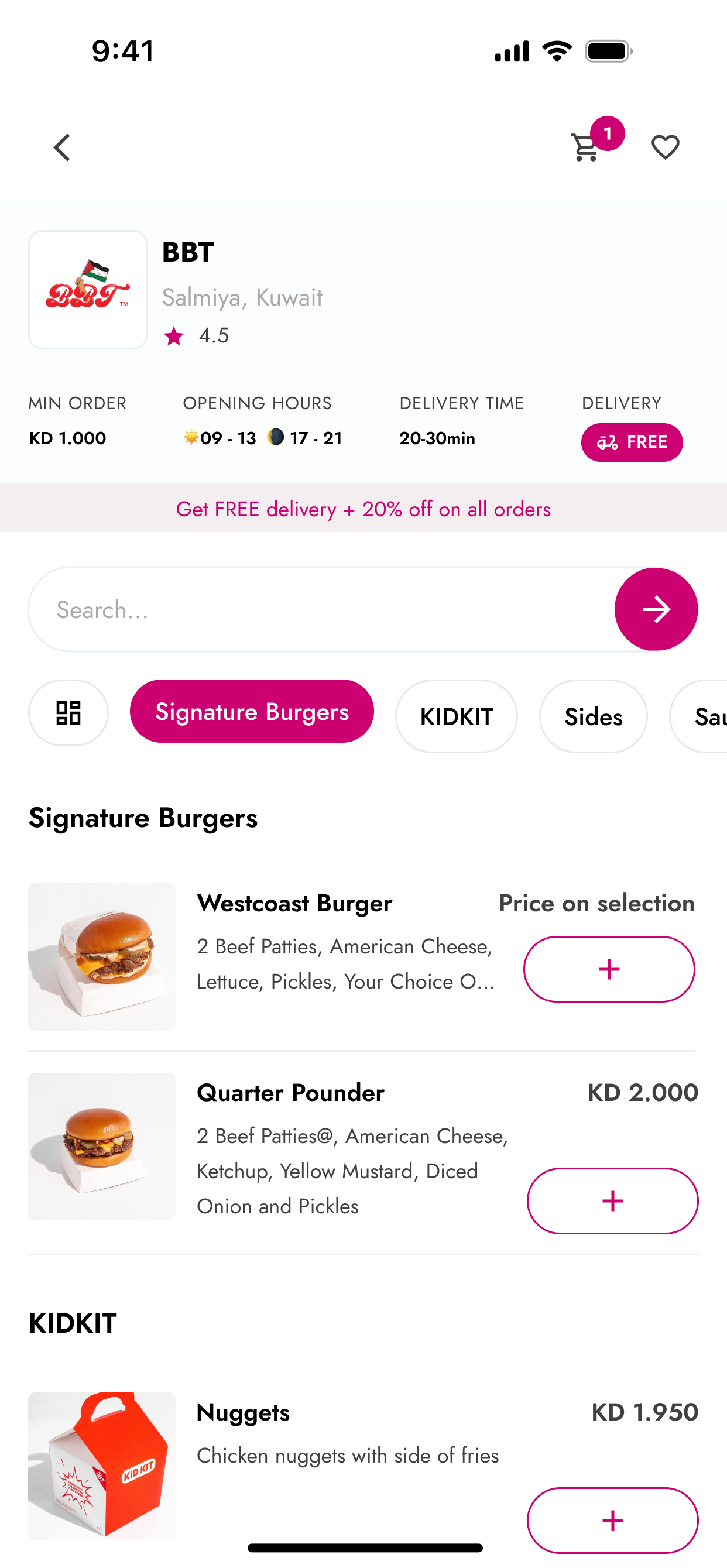
Streamlined cart summary shows when cashback will be earned or applied, removing ambiguity before checkout.
Contextual explanation that clarifies how cashback works and prevents misapplication during checkout.
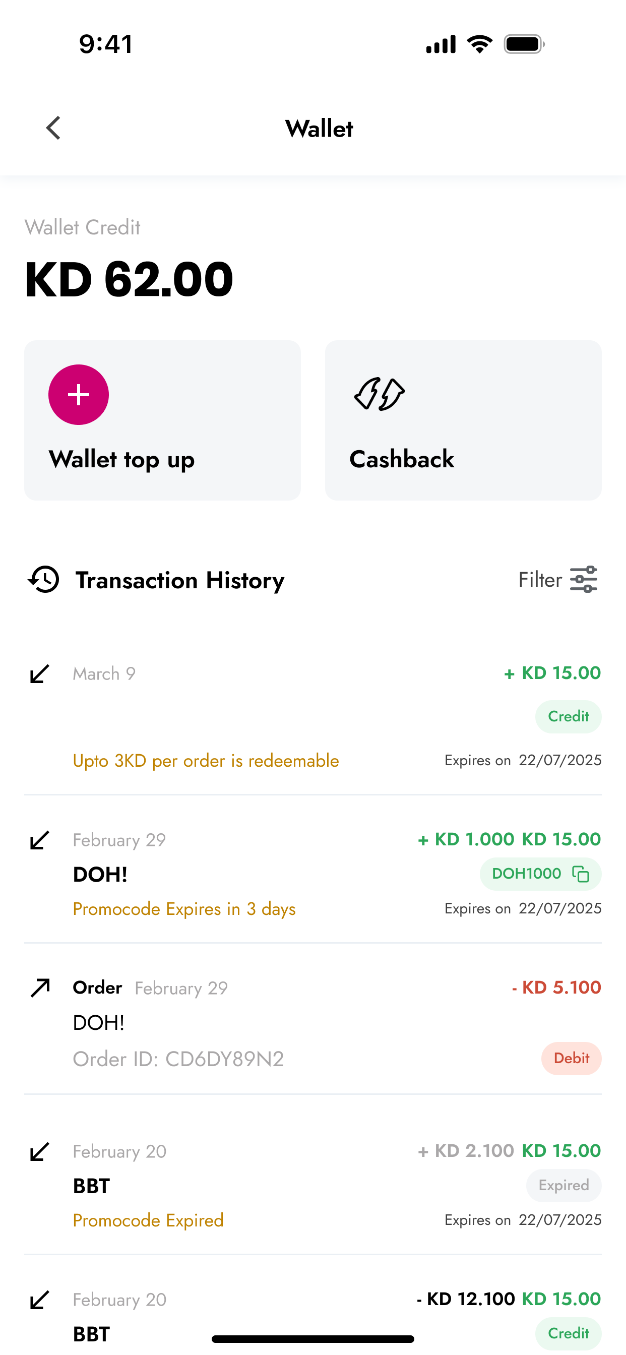
Clear wallet view with structured transaction history, filtering, and transparent balance logic.
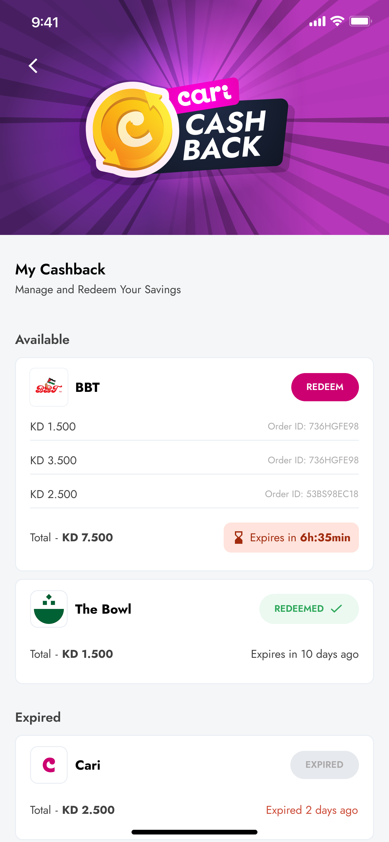
Streamlined cashback management with grouped balances, expiry visibility, and simple redemption controls.
RESULTS & IMPACT
- ↑ 52 percent in cashback redemption
- ↓ 22 percent reduction in cart abandonment
- ↓ 68 percent fewer support tickets
- Improved app rating and clearer reward usage
Why it mattered: Cashback confusion was a major source of checkout friction and support volume. Fixing it improved conversion, reduced errors, and lowered operational cost.
Cari Offers Redesign: Cleaner Discovery, Faster Redemption, Higher Engagement
A complete redesign of Cari’s Offers experience to improve deal visibility, clarify eligibility, and create a predictable discovery flow. The new Offers hub organizes every discount, cashback reward, and subscriber perk into clear categories with consistent card structures for faster browsing and redemption.
PROBLEM
- Users had no dedicated place to browse all available offers
- Offers were hidden inside restaurant cards
- No differentiation between cashback, discounts, or subscriber perks
- No filtering, comparison, or expiry visibility
- Low engagement because users did not know deals existed
BEFORE
Offers were buried inside vendor cards, leading to low discovery and inconsistent visibility.
Cashback, discounts, and perks appeared together without structure or eligibility clarity.
SOLUTION
- Introduced a unified Offers hub
- Three clear categories: Offers, Cashback, Unlimited (subscriber perks)
- Standardized cards with consistent image ratios, tags, and expiry indicators
- Scroll-friendly layout for easier browsing and comparison
- Clear separation between types of deals and eligibility
- Purposeful empty states for predictable behavior
FINAL SCREENS
Clear entry point from the home screen increases visibility and gives users a predictable place to start finding deals.
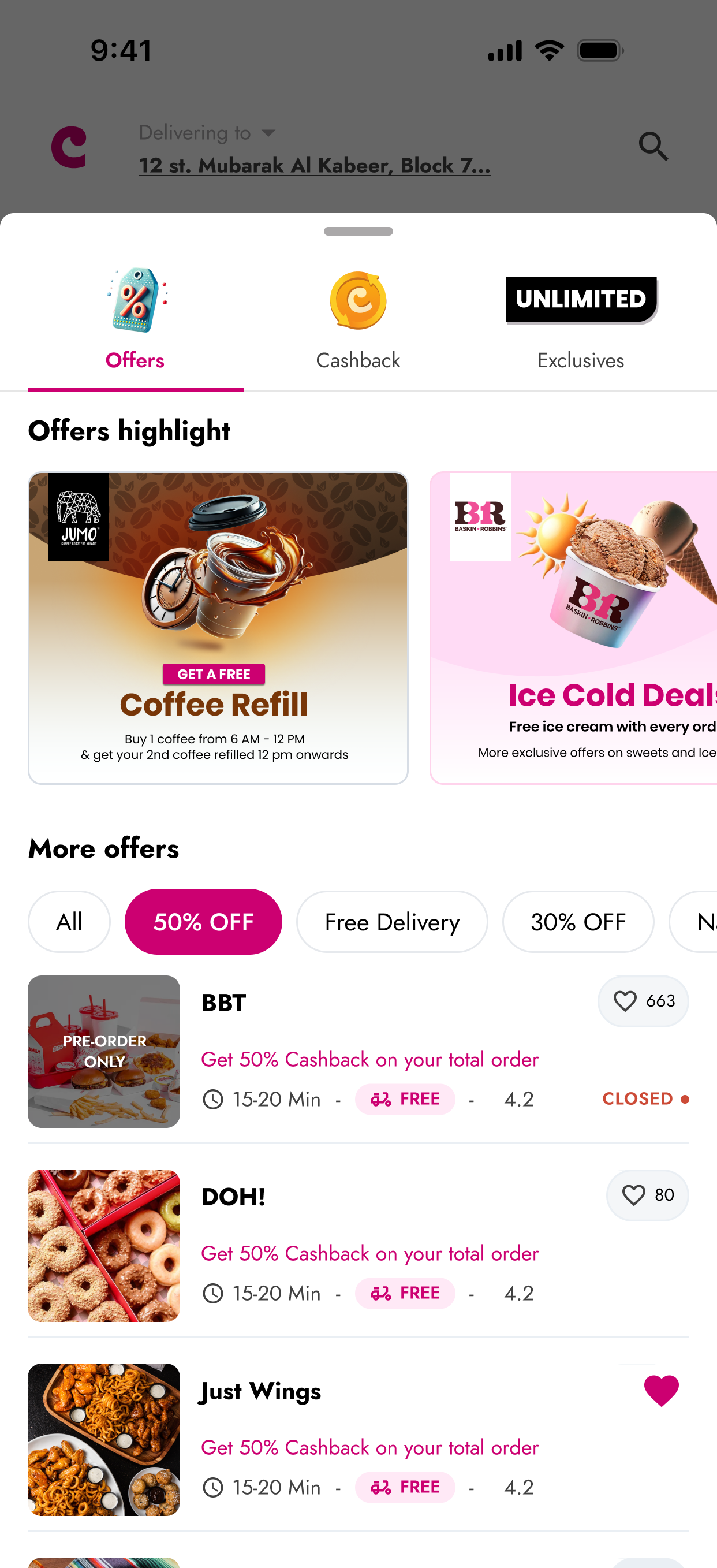
All deal types are organized into one tab with filters, readable tags, and consistent card structures for easier comparison.
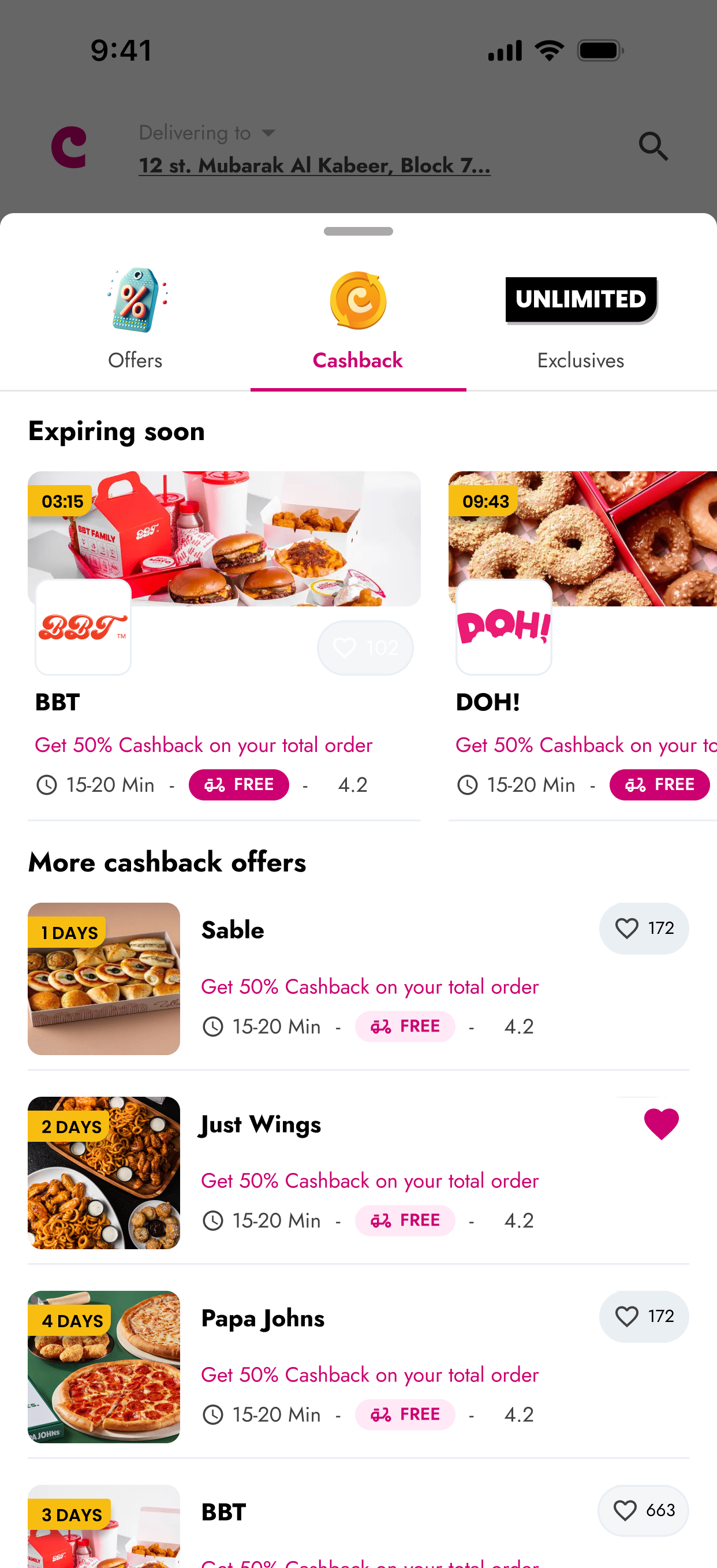
Cashback-specific offers are grouped together with expiry indicators, reducing confusion with standard discounts.
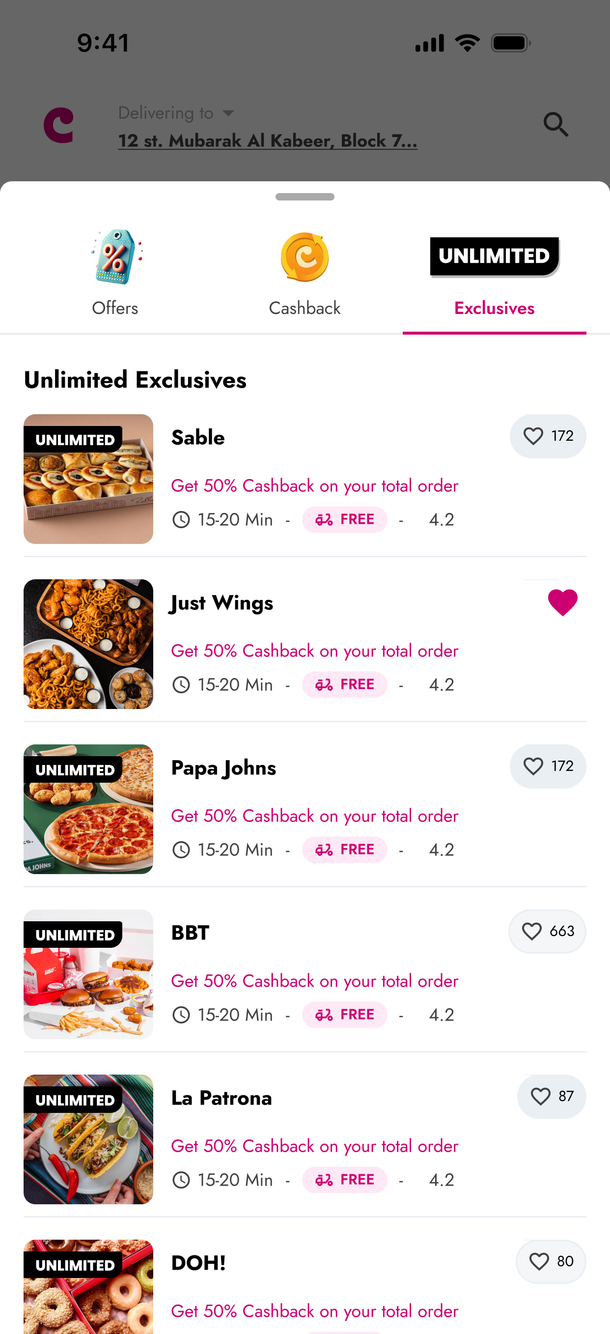
Dedicated space for Unlimited subscriber benefits, improving clarity and reducing missed perks.
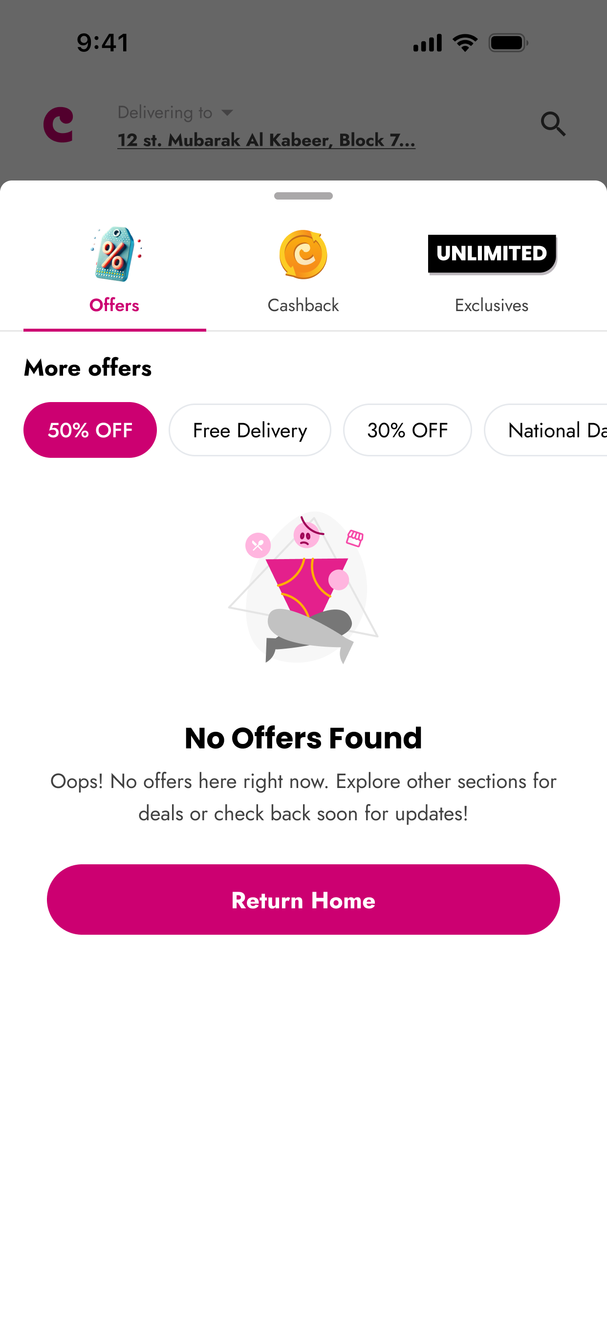
A purposeful empty state removes ambiguity and guides users back to relevant sections when no deals match filters.
RESULTS & IMPACT
- Higher engagement on high-value offers
- More predictable and consistent deal redemption
- Increased visibility of discounts and cashback
- Clearer differentiation between deal types
- Reduced misapplied discounts and support issue.
Why it mattered: Before the redesign, users didn’t know deals existed or couldn’t distinguish between cashback, discounts, and subscriber perks. This redesign unified the entire Offers experience, improved clarity across deal types, and created a reliable discovery flow that supported predictable user behavior and stronger vendor visibility.
Cari Assist: AI-Powered Ordering & Discovery
An AI-powered ordering experience that understands user intent across food, grocery, and non-food services. Cari Assist converts vague, conversational queries into structured ideas, ingredient-level breakdowns, and complete checkout flows while balancing AI guidance with clear user control.
PROBLEM
Traditional menu browsing required users to navigate multiple categories, compare options across different restaurant pages, and manually input dietary restrictions repeatedly. This created friction especially for users with specific dietary needs, first-time users unfamiliar with menus, and users ordering for groups. Additionally, users wanted help with broader needs beyond food, booking hotels, planning trips, finding experiences but had no way to access these services.
BEFORE
The old search was limited to basic keyword matching users had to type exact restaurant or dish names. No conversational input, no understanding of intent, and no way to handle requests like "something healthy for lunch" or dietary restrictions.
Basic search with no guidance or suggestions
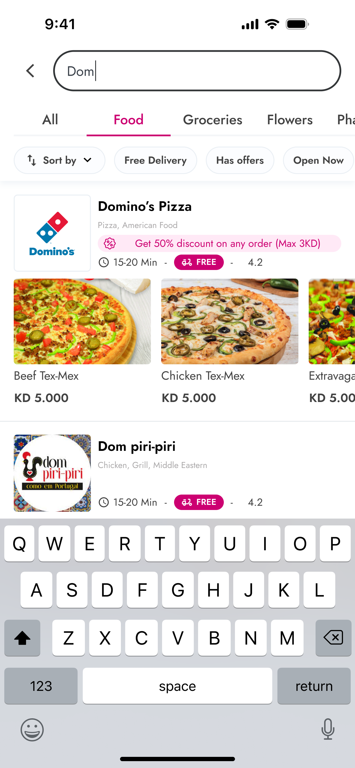
Exact keyword matching only, no recommendations.
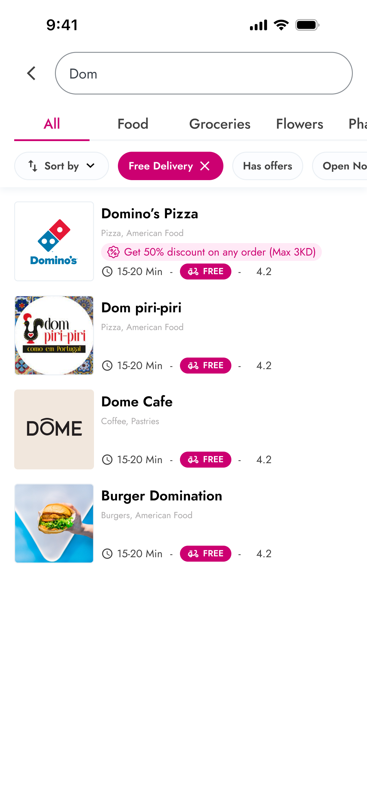
Simple text results no contextual understanding
SOLUTION
Cari Assist interprets natural language input to guide users through complete ordering flows. The experience balances automation with user control: suggestions are editable, AI choices are visually confirmed, and users can switch back to traditional browsing anytime. The assistant handles ambiguous input gracefully and extends beyond food to hotels, flights, flowers, gifts, and various services, surfacing relevant options based on context.
FINAL SCREENS
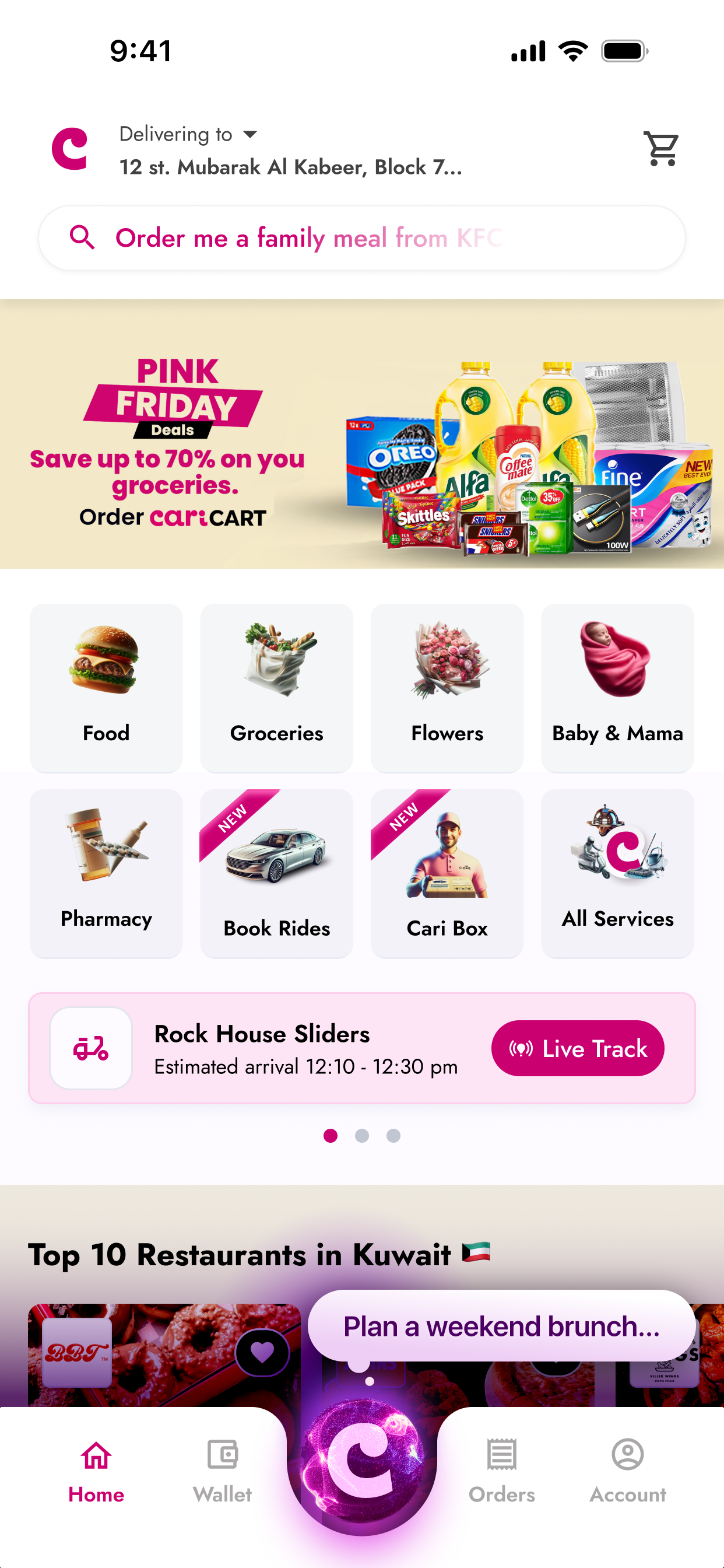
Clear Assist entry point on the home screen increases visibility and encourages users to try conversational ordering.
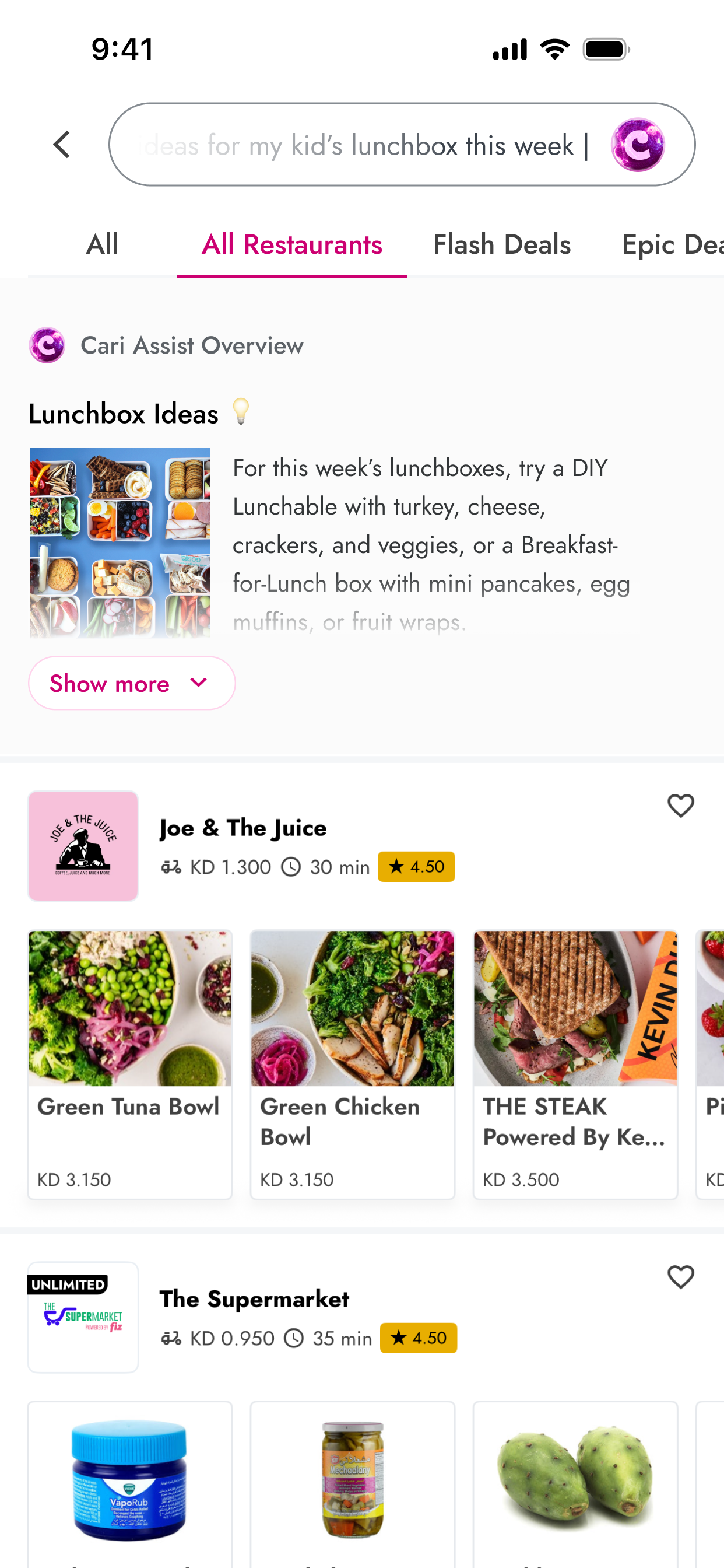
AI interprets broad intents and returns structured, visual recommendations instantly.
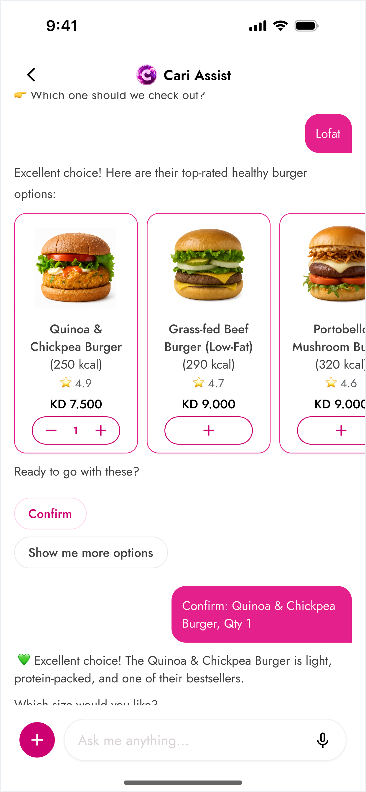
Assist tailors suggestions to dietary needs and intent, reducing browsing time and menu friction.
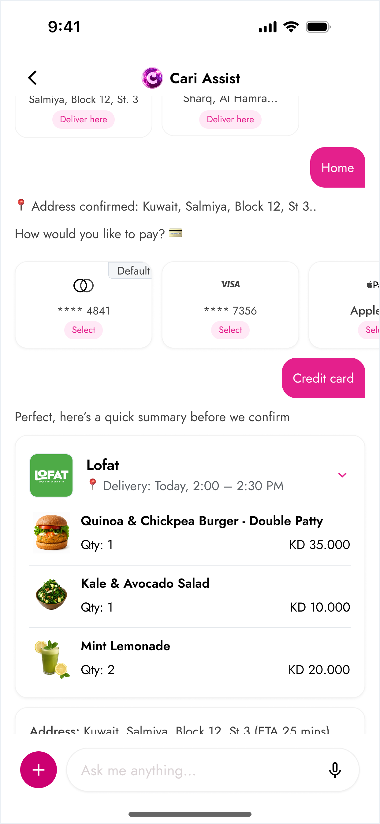
Streamlined checkout flow with a clear, editable order summary, reducing friction before confirmation.
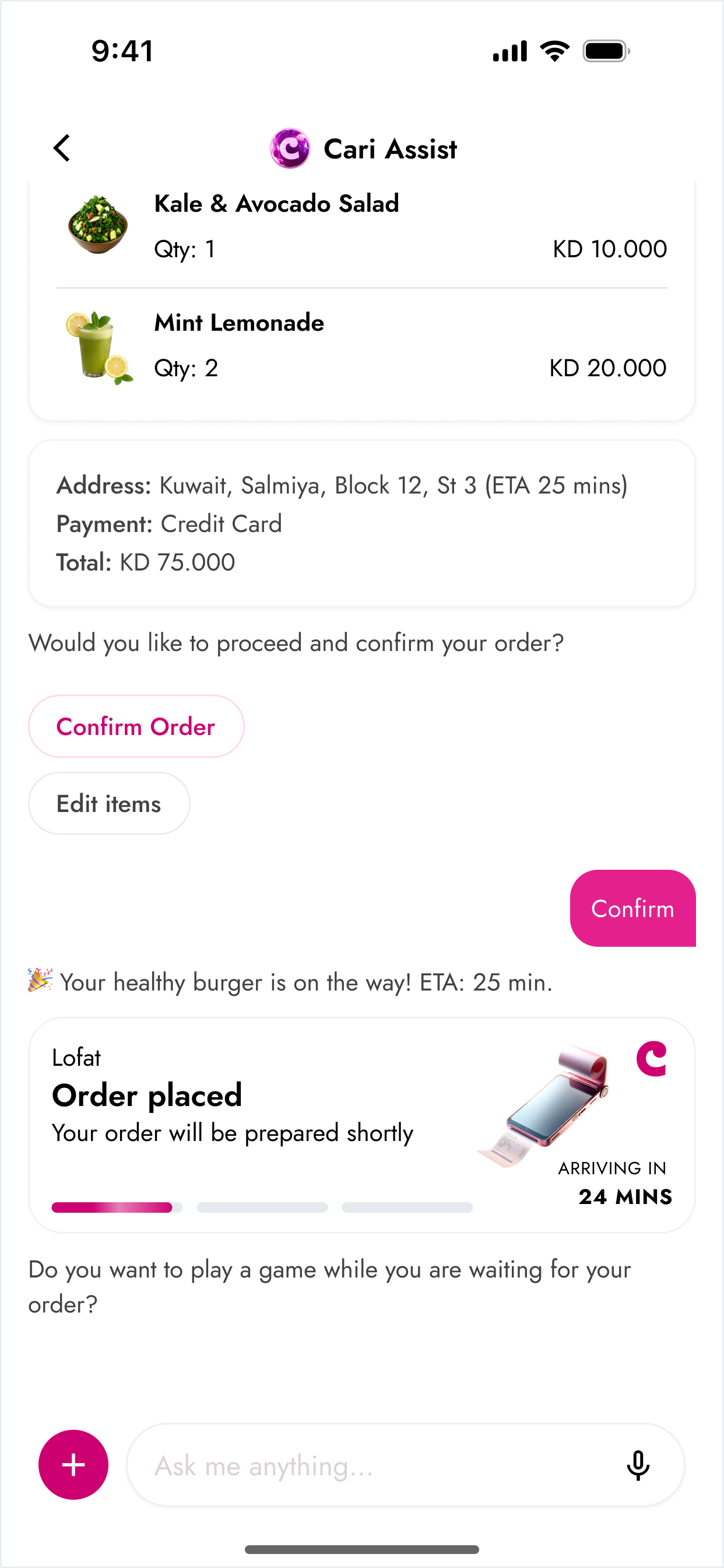
Smooth transition from AI ordering to delivery tracking, giving users clarity and confidence after placing an order.
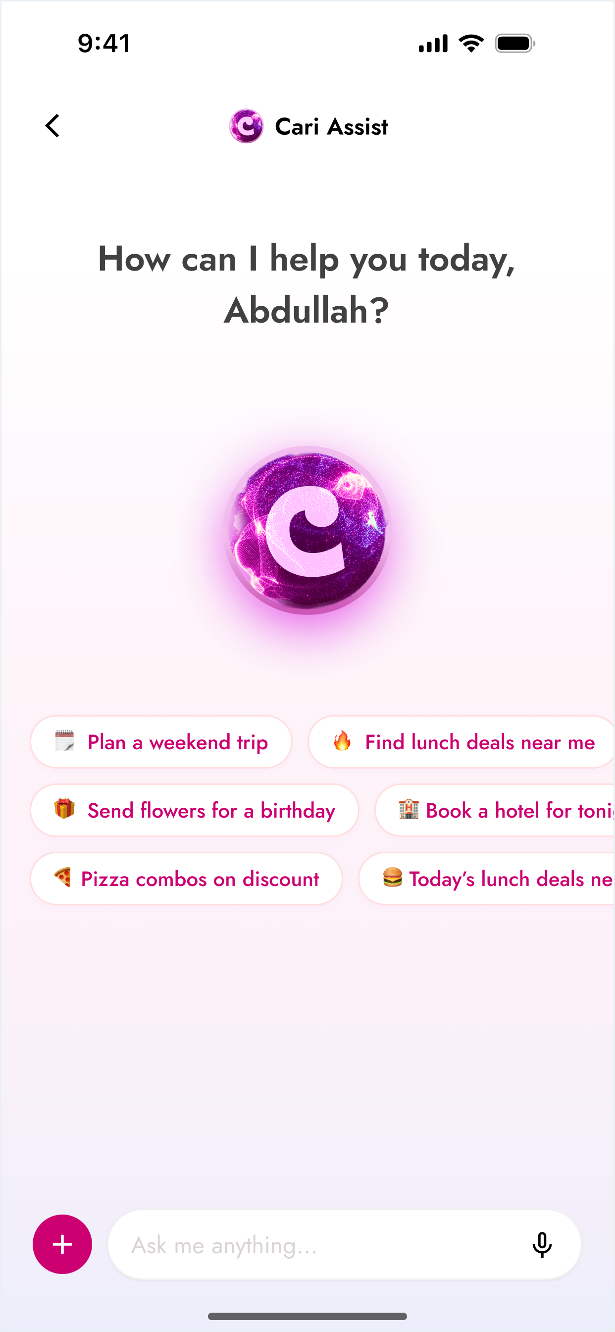
Natural language interface with contextual prompts that help users discover food and non-food services effortlessly.
RESULTS & IMPACT
- Faster order completion
- Higher order value when using Cari Assist
- 3× increase in session duration
- 58 percent of users discovered non-food services
- New revenue stream from booking commissions
- Positioned Cari as a super-app beyond food deliver
Why it mattered: Traditional browsing forced users to navigate categories, compare vendors, and reapply dietary filters repeatedly. Cari Assist removed this friction by understanding intent, managing ambiguity, and guiding users conversationally, opening new verticals and improving both speed and revenue opportunities.
The Cari
Ecosystem
Available on App Store & Google Play
Over 1 million installs across iOS and Android, with a strong user base in Kuwait and the GCC region.
- Markets (Kuwait, Saudi Arabia, UAE)
- Products (Delivery, grocery, logistics, B2B tools)