PRODUCT DESIGN CASE STUDY
Sihaty: Revolutionizing Telehealth in the GCC
Sihaty is a telehealth platform designed to solve healthcare inefficiencies in the GCC region, particularly in Kuwait. It provides patients with access to medical professionals worldwide, easing the burden of medical travel and helping local hospitals manage overcrowded emergency rooms. Sihaty offers a modular healthcare system that integrates telehealth, patient monitoring, and health information management, making it the connective tissue of healthcare systems.
My Role
As the Lead Product Designer, I led the design of the Sihaty platform from its early concept to full-scale implementation. My role involved working closely with medical professionals, product managers, and engineering teams to ensure the platform addressed user needs while adhering to industry standards such as HIPAA compliance.
Key responsibilities: Discovery, User Research, User Flow, Visual Design and Testing.
Team Structure
– 1 Product Owner
– 1 Product Manager
– 1 QA Tester
– 2 Mobile Developers
– 2 Backend Developer
– 2 Product Designers (including myself as the lead designer)
Year
2019 - 2022
Problem
Healthcare systems, particularly in regions like the GCC, are fragmented, expensive, and reactive. In Kuwait, a large percentage of the population travels abroad for recurring medical consultations due to the belief that international healthcare professionals are better trained. Meanwhile, local hospitals face overcrowded emergency rooms, especially during the COVID-19 pandemic.
Sihaty was created to address these challenges by providing a modular telehealth platform that connects patients with specialized healthcare professionals from around the world, reducing the need for costly travel. It also tackles systemic issues such as the rising costs of chronic disease management and the lack of healthcare integration. With a secure telehealth solution, modular health information systems, and innovative remote patient monitoring, Sihaty offers a scalable solution that can transform healthcare delivery in the GCC and beyond.
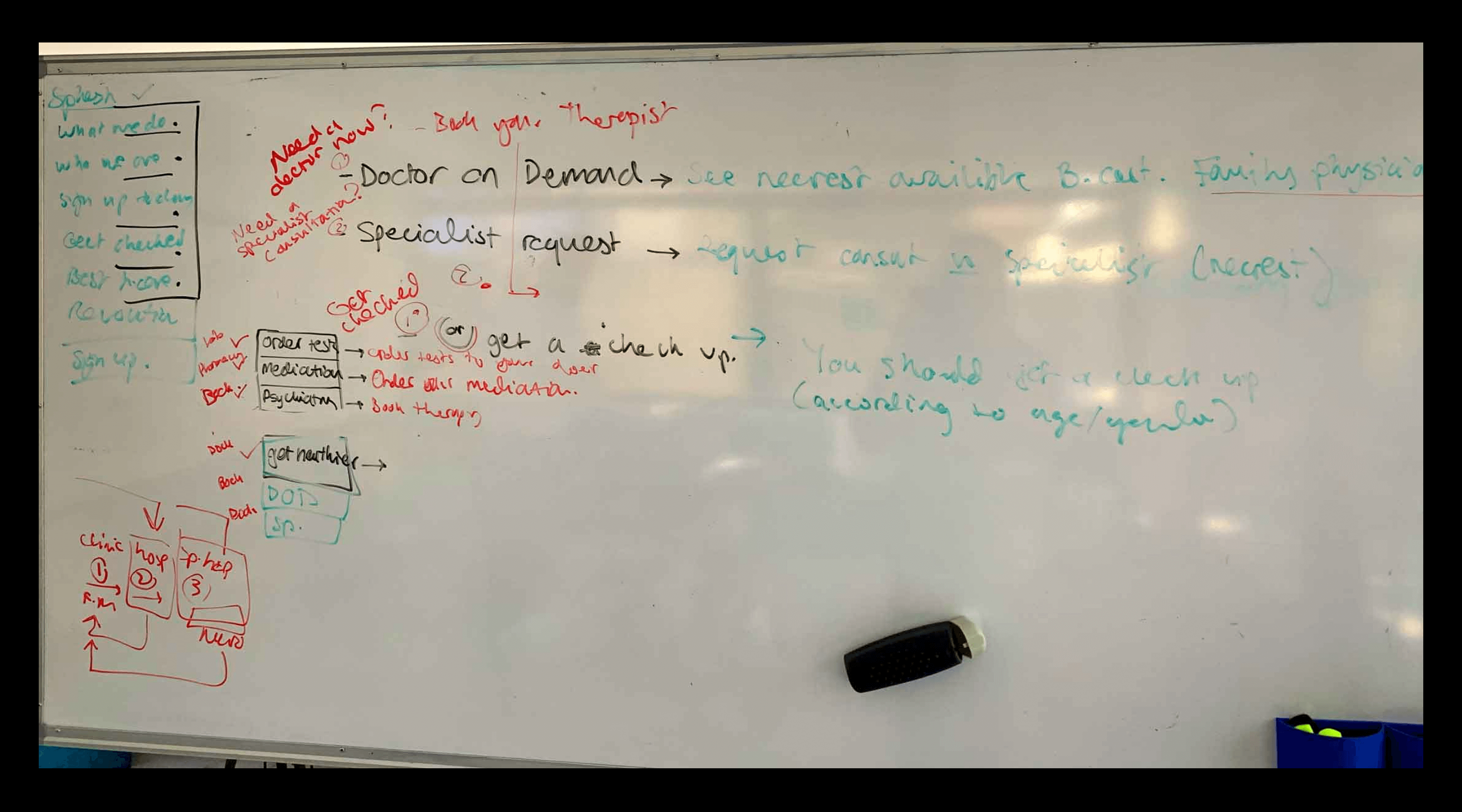
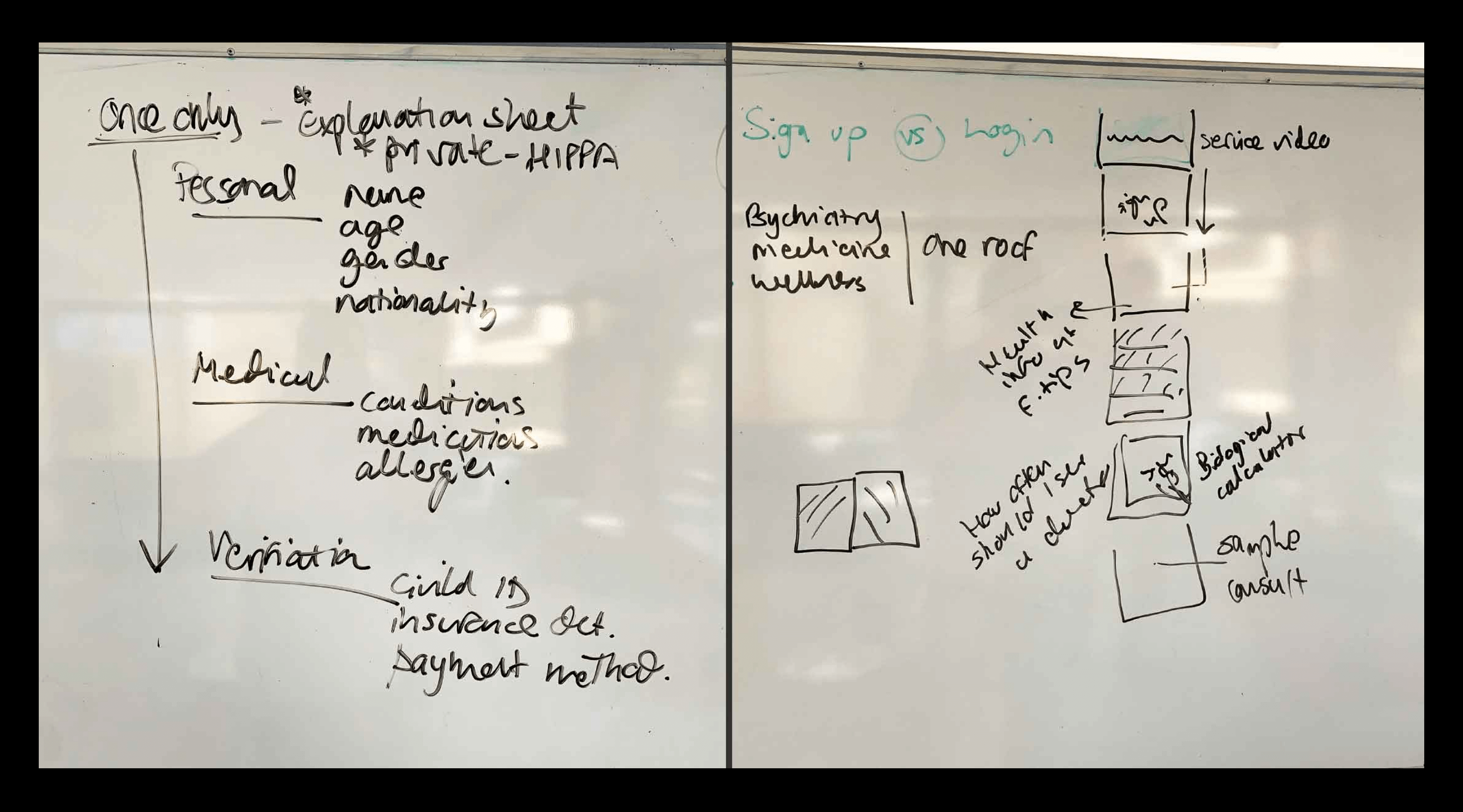
Discovery session
Project Goals
Sihaty's product requirements and objectives were established and documented. These goals were to enable users to:
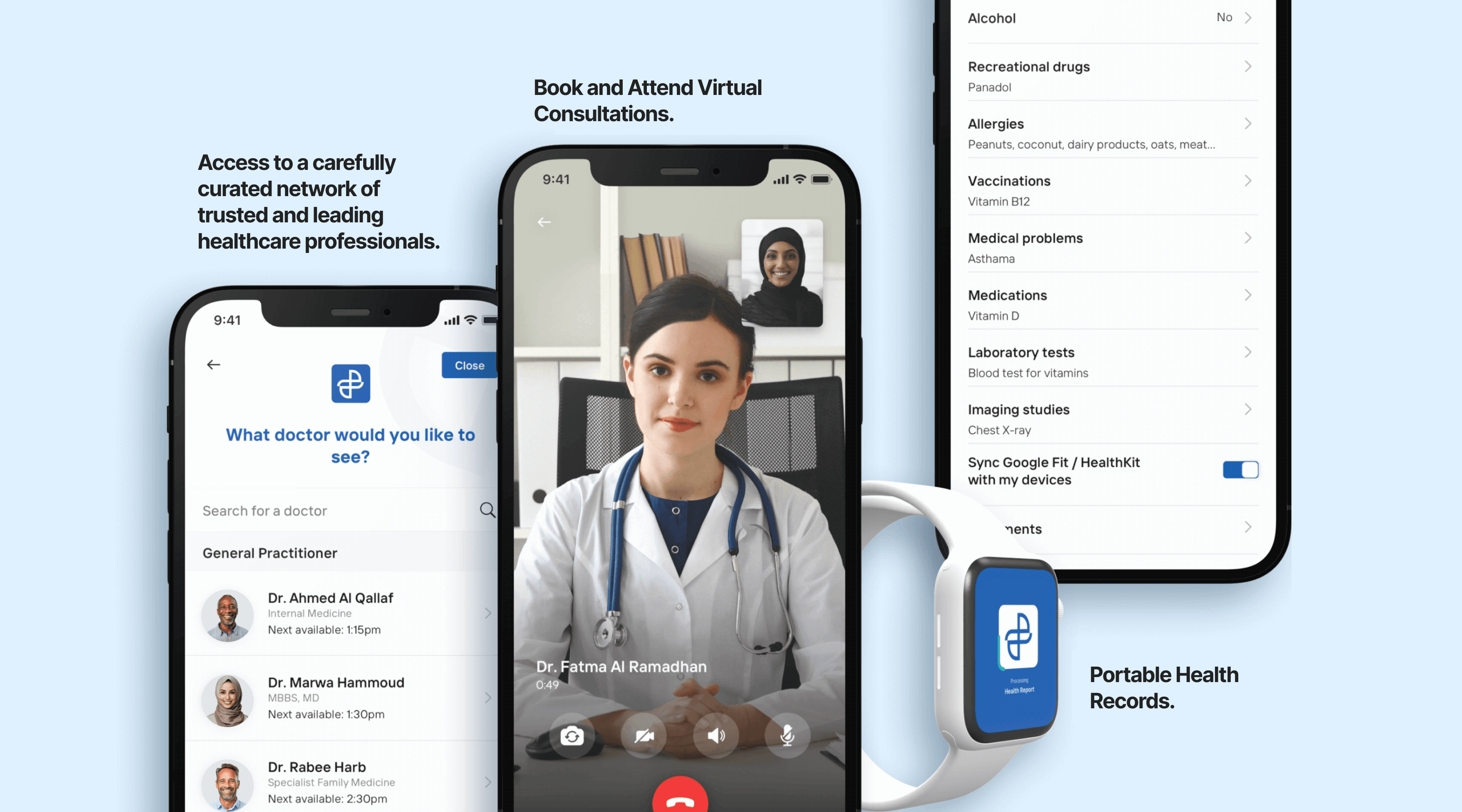
Virtually book and attend consultations with foreign healthcare professionals in different parts of the world from the comfort of their homes.
Schedule consultations by answering a few questions about their symptoms/nature of their consultation, so they can be directed to the right healthcare professional.
Save, update and share their healthcare records with the healthcare professional on the Sihaty platform.
Pay for consultations and prescriptions using their existing insurance through Sihaty.
The Process
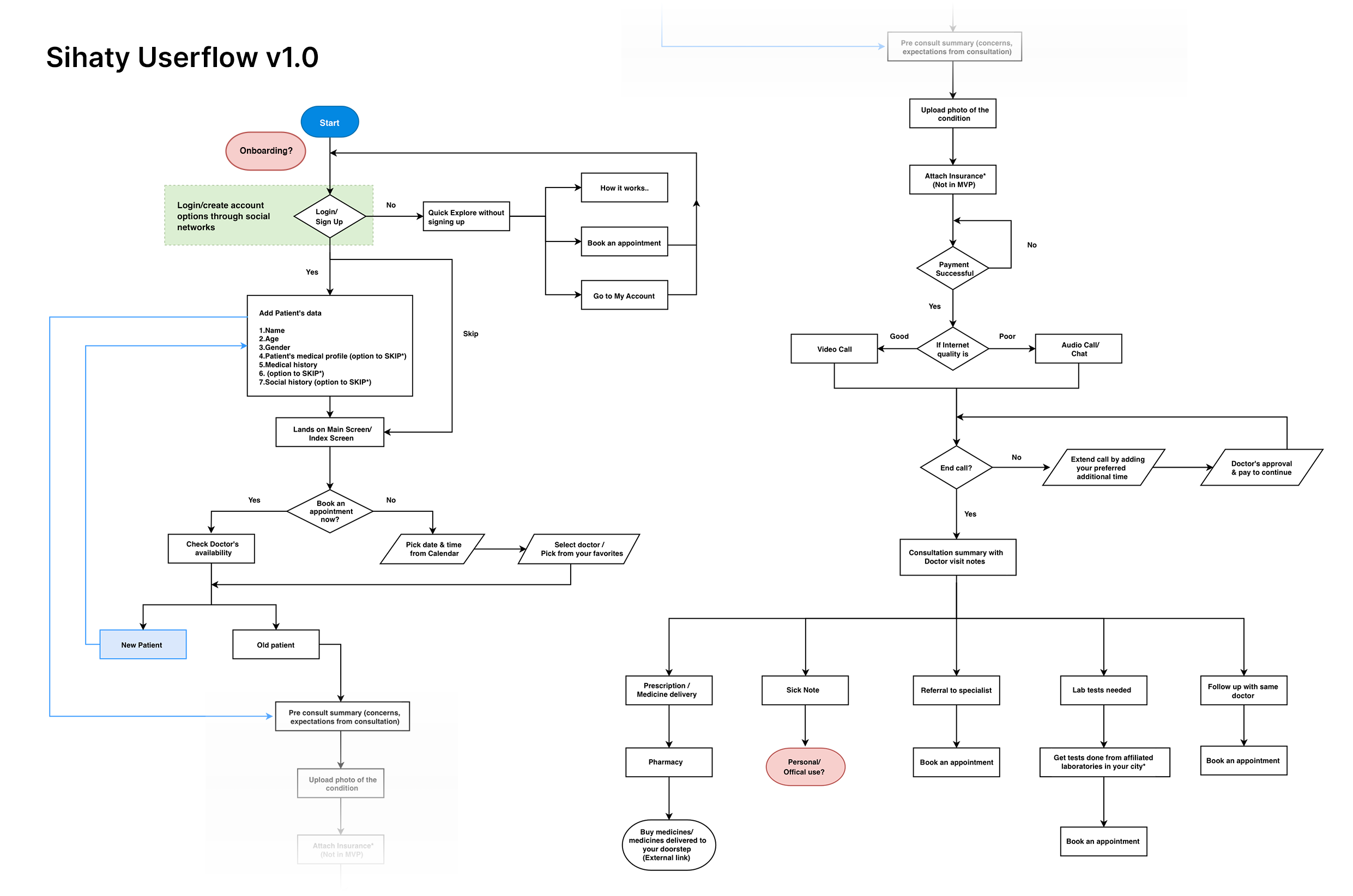
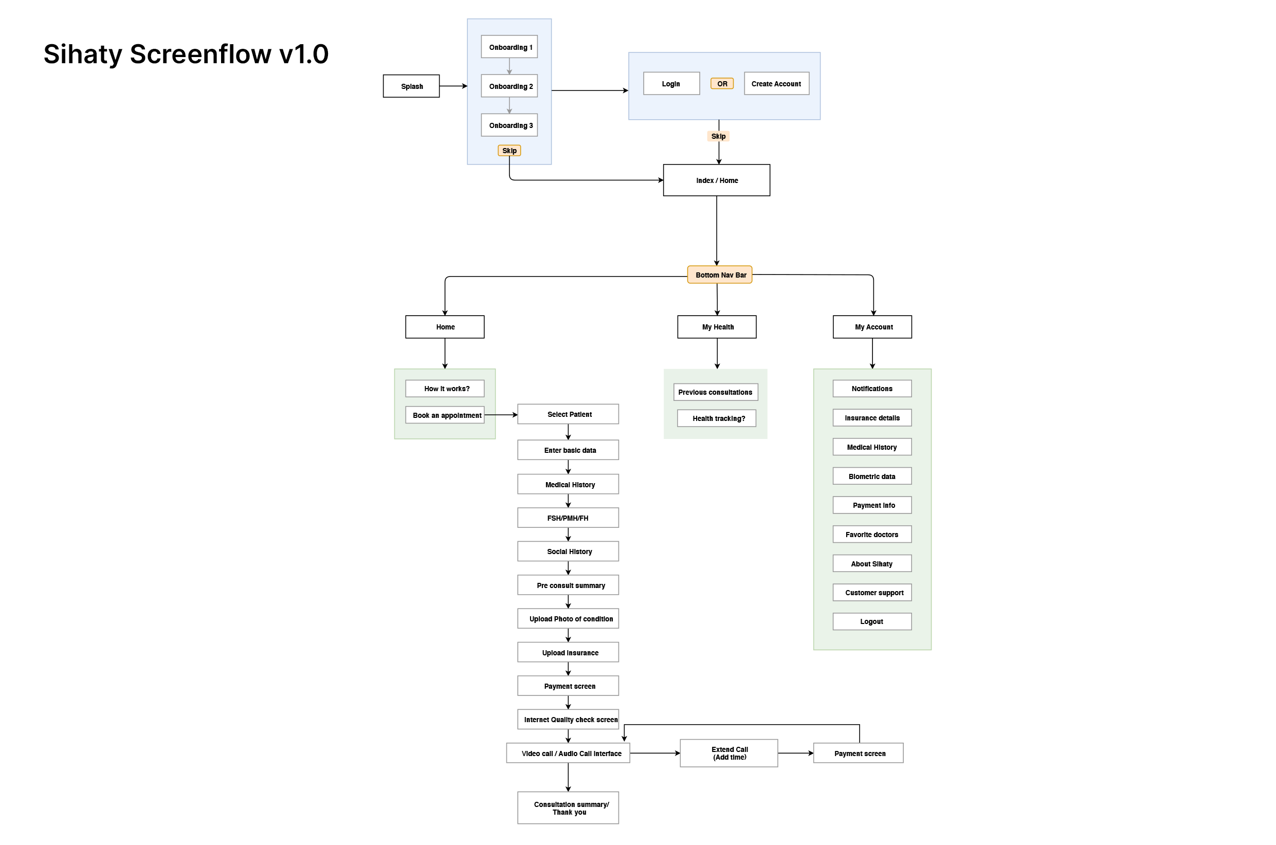
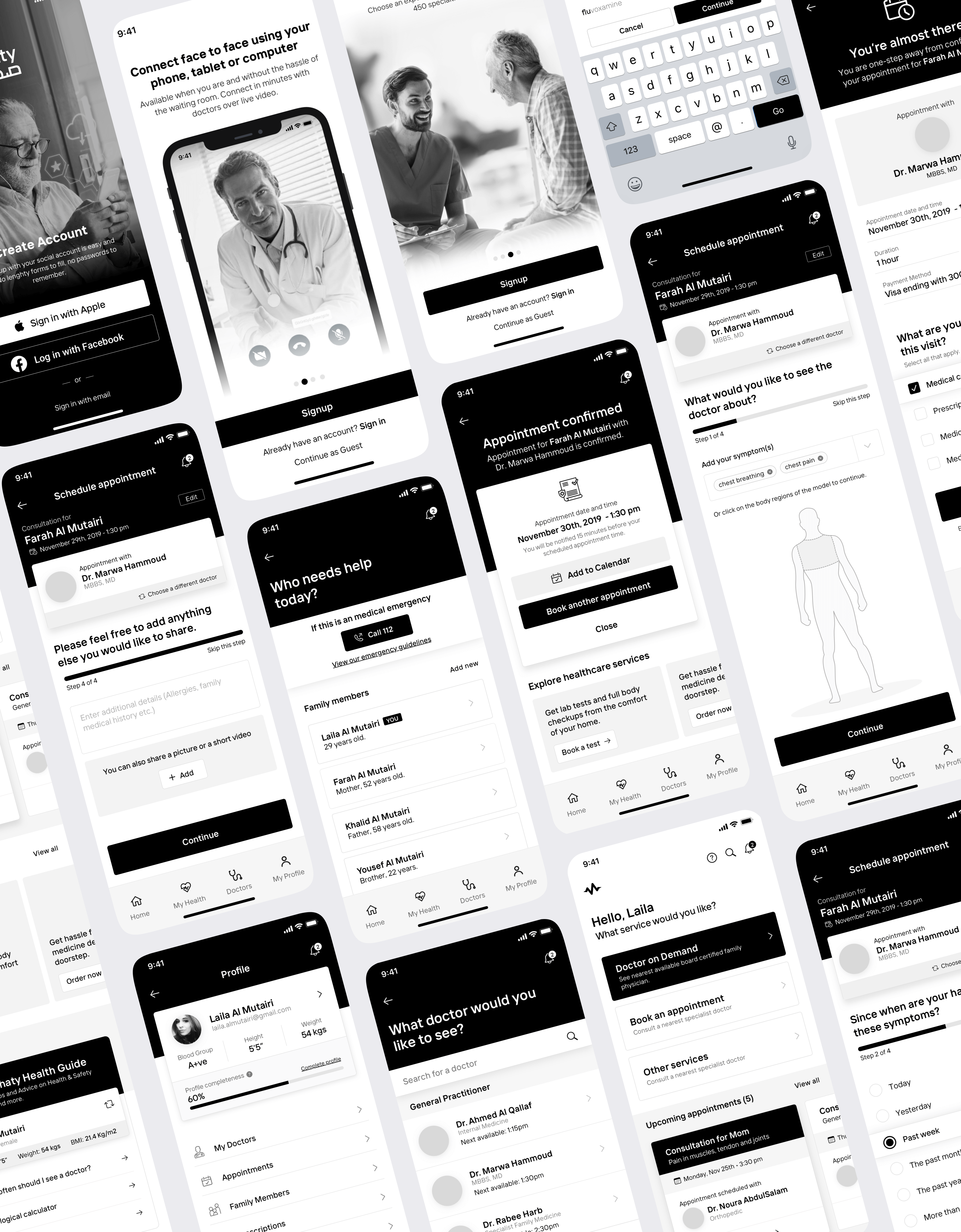
After reviewing the product requirement document and clearing up the grey areas, I created a userflow, a screen flow, and some wireframes, focusing on the main areas that needed to be explored, which were:
Easy, Seamless and Secured Onboarding
For many people signing up to Sihaty, this would be their first experience with a telehealth platform. It was important that the features and benefits of Sihaty were explained in a clear and concise way and that users were reassured that all information they keep on Sihaty is safe and secure. For people who may be signing up when they need urgent care, it was also important that the sign-up and onboarding process be fast and seamless.
Consultation flow
Aspects of the consultation flow such as; how users select symptoms, how to determine if a consultation is urgent or not, how to determine what specialists to show to users, etc, needed to be designed to match the mental models and current industry best practises.
Wireframing
The wireframing stage was an opportunity to explore the different approaches to these areas and to create testable prototypes which could be used to gather data. At this stage, I also looked into competitor platforms to determine what they were doing well and where there were opportunities to improve the telehealth experience for people.
Usability Testing
With testable prototypes ready, we recruited 21 participants for usability studies. Given Sihaty's focus on families, we enlisted friends and family members of the Sihaty team to participate. This approach helped us gather valuable data about potential users' mental models and product-market fit without early public exposure.
Data Collection and Analysis:
The data and insights from these studies were summarized and used to generate actionable recommendations, all of which were shared with the team.
Test findings
83%
of participants understood the product's core premise and overall concept.
93%
of participants enjoyed the overall experience of using the app.
61%
of participants preferred a design approach that reduces anxiety associated with doctor consultations.
67%
of participants found the pre-consultation symptoms questionnaire too lenghty and preferred a shorter version.
Recommendations and Actions:
Based on these findings, we proposed several key changes:
- Simplify the design to reduce anxiety and enhance user comfort.
- Shorten the pre-consultation questionnaire to improve user satisfaction.
- Further refine the onboarding process to ensure the core premise is clear to all users.
Impact of Changes:
As a result of the usability testing feedback, the product was more aligned with user expectations and needs, leading to significant improvements in user engagement. The iterative process ensured that the final product was both user-friendly and market-friendly.
Visual Designs,
Iterations & Development
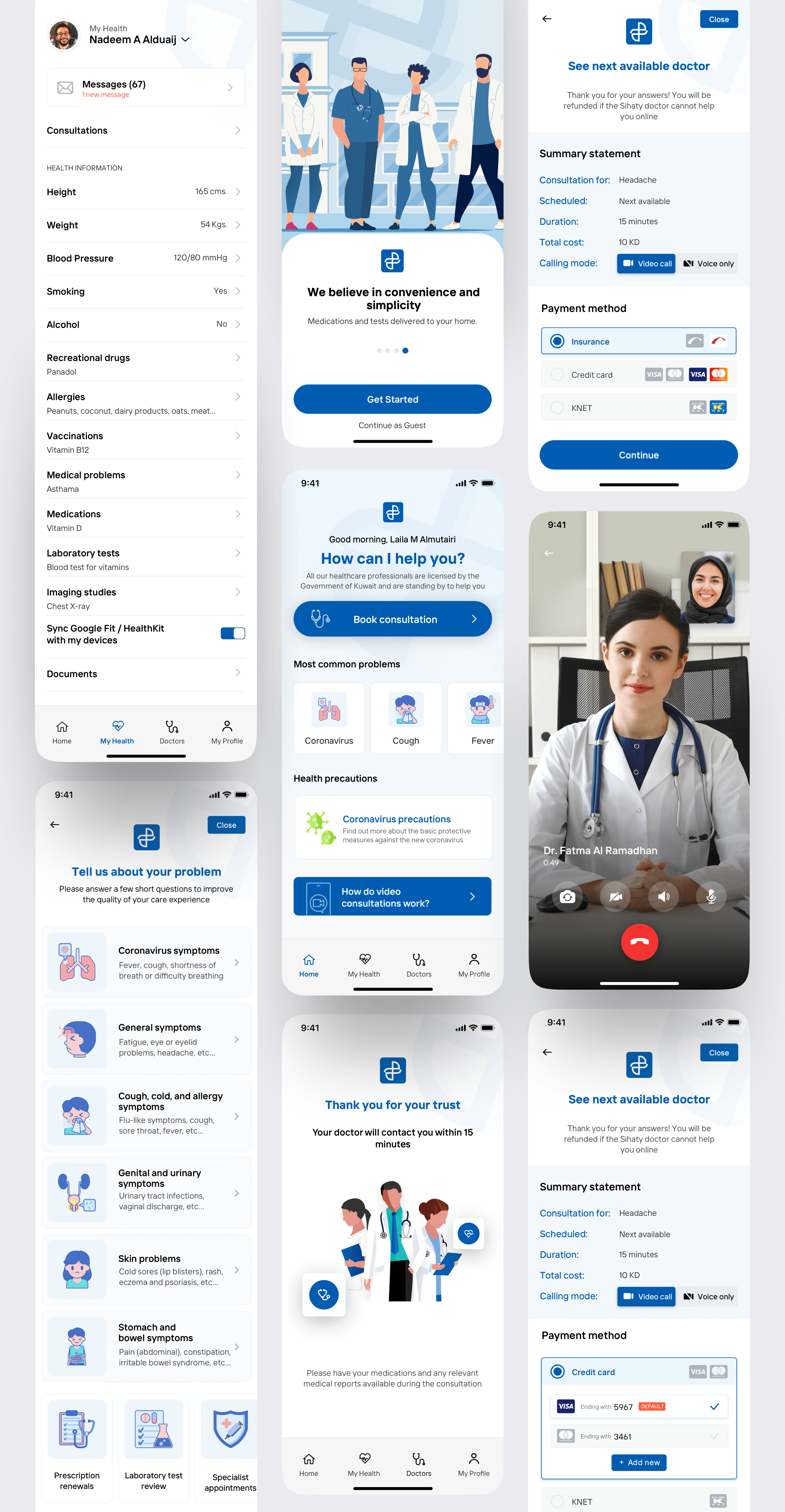
I created visual designs based on the wireframes, insights and recommendations from the usability study and the branding agency's brand guidelines. At this stage, I explored different visual directions focused on:
Consultation flow - Ensuring the consultation flow was as similar as possible to the way it would occur in the physical world. The objective here was to reduce friction by replicating patients' and healthcare professionals' mental models of attending consultations physically.
Symptoms questionnaire - Making sure the questionnaire patients fill out before being presented a list of specialized healthcare experts is simple to comprehend, straightforward, and quick to complete.
Privacy - Ensuring that users know that their health records and information shared during consultations are private and secure (HIPAA compliant). Consultation privacy was brought up by multiple participants during testing.
It was vital for women who wear Hijabs (facial and full body coverings) to be able to maintain the same level of privacy as they would in the real world by wearing Hijabs. We resolved this by allowing consumers to choose between audio and video consultations.
I kept refining the visual design throughout the development process, ensuring every update prioritized user needs, business objectives, and technical limitations.
During testing, we found that users responded better to a lighter, more approachable design. In response, I replaced healthcare imagery with illustrations to create a friendlier experience across the app.
From Beta to Launch
The app was broken down into milestones during development to track progress and carry out effective and efficient QA tests.
A beta version of Sihaty was used to run pilots with a variety of user groups. We used a variety of user groups so as to determine what the most common/important feedback was. The feedback generated was used to refine the mobile application. After a month of gathering feedback and iterating, Sihaty was launched to the public.
White-labelling
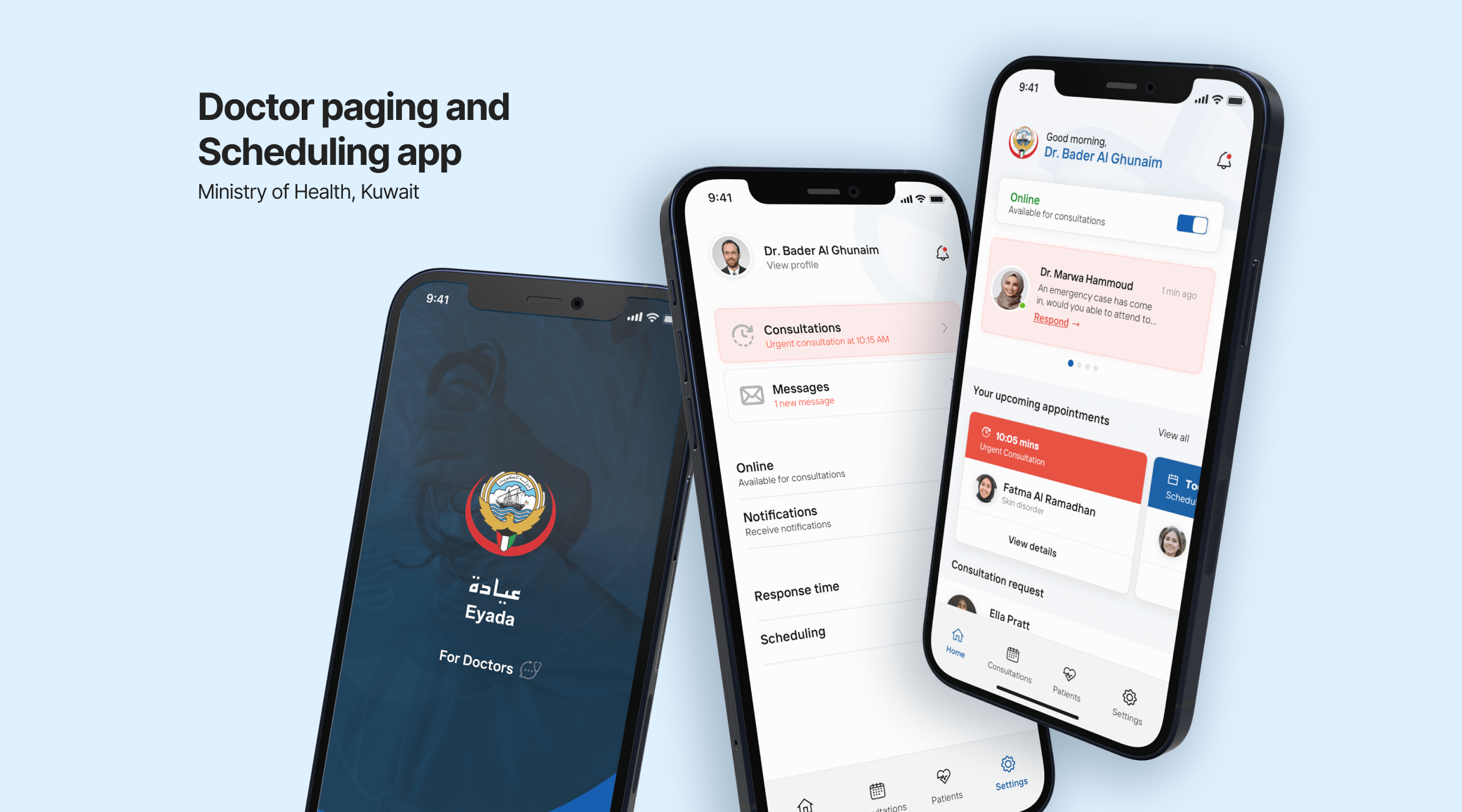
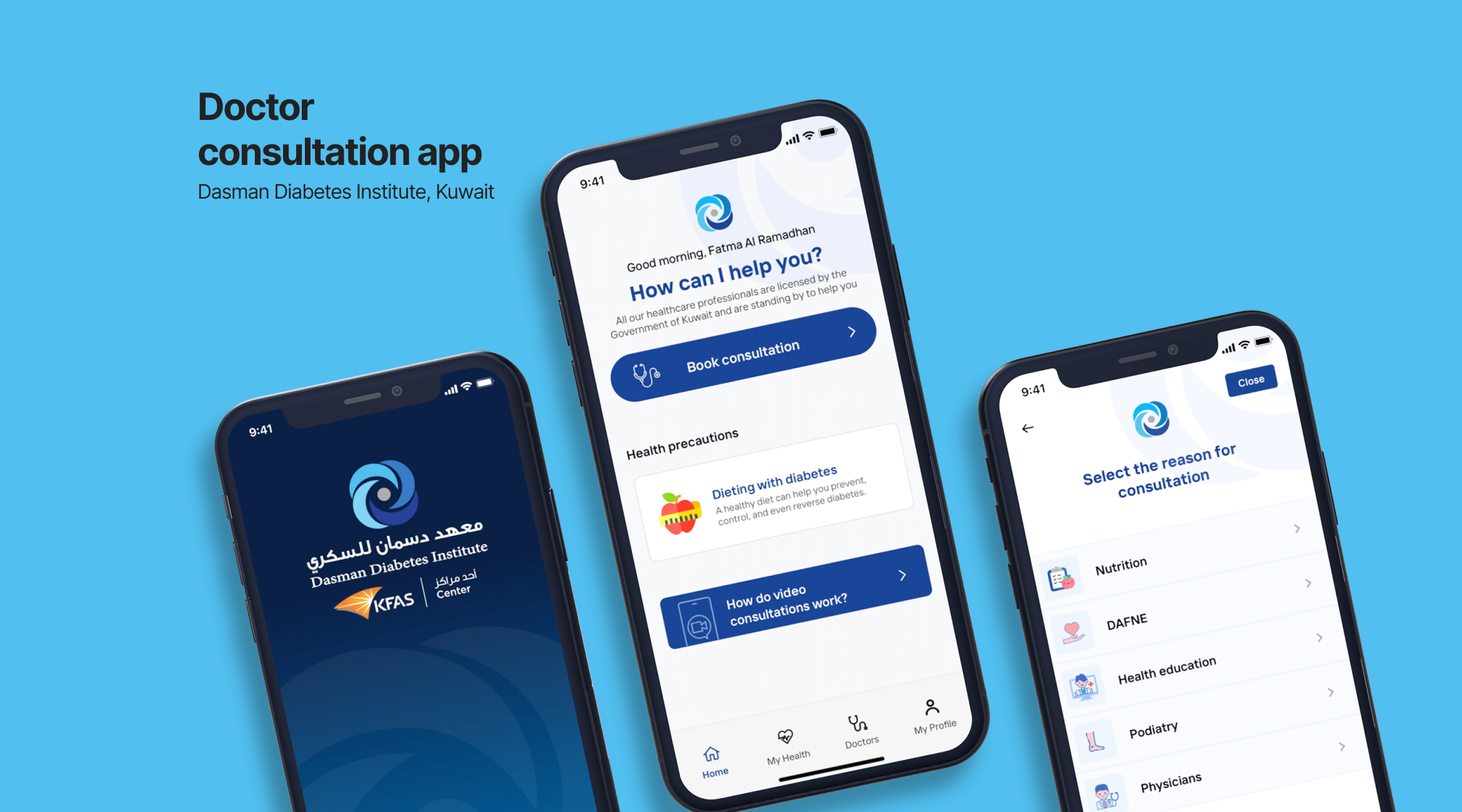
Following the successful launch of Sihaty, we expanded the platform by offering white-label versions to clinics and hospitals in Kuwait. I led the redesign for several institutions, ensuring customization while maintaining core functionality.
Recap & Takeaways
Sihaty’s agile design approach allowed us to quickly adapt to the COVID-19 pandemic, incorporating guidelines and assessments to ease the strain on local ERs. Collaborating with a medical expert on our team helped us meet industry best practices and build a solution that addressed real-world healthcare pain points in the GCC.
Sihaty
at a glance
Available on App Store & Google Play
Over 200,000 app downloads
Recently raised $1.3 million in a pre-Series A round
