Cari · Mobile Subscription · 2025
Designing a subscription flow for frequent Cari customers.
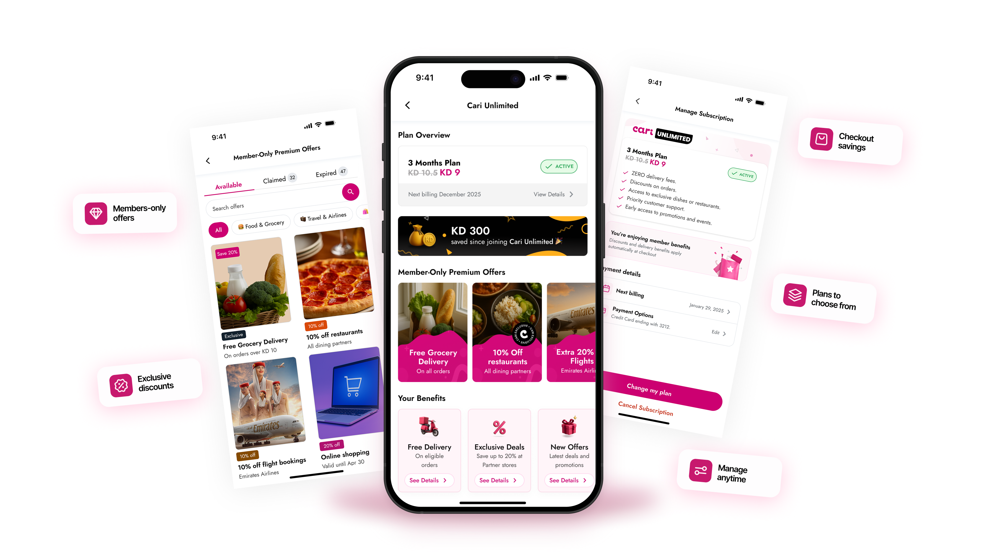
Cari Unlimited was designed for users who ordered often and needed a clearer reason to keep returning. The challenge was not just explaining the value. It was making that value easy to understand, showing where users would save, and fitting the plan into the existing ordering journey without adding friction.
I led the subscription UX direction and shaped the core flow, working closely with the Product Manager, Engineering Lead, and another product designer as the feature moved from product thinking into design and implementation. The goal was simple: make the value easy to understand, place the subscription where it made sense in the ordering journey, and support the key states after signup.
Context
Cari already had repeat ordering behaviour. The subscription opportunity was to make it feel intentional.
Frequent Cari users were already ordering regularly across multiple verticals. The question was whether a subscription model could give that behaviour a clearer shape, make the value more visible, and give users a reason to stay within Cari rather than ordering elsewhere.
The product decision was to keep it simple. One plan, clear benefits, and a flow that sat inside the existing ordering experience rather than competing with it.
Core product decision
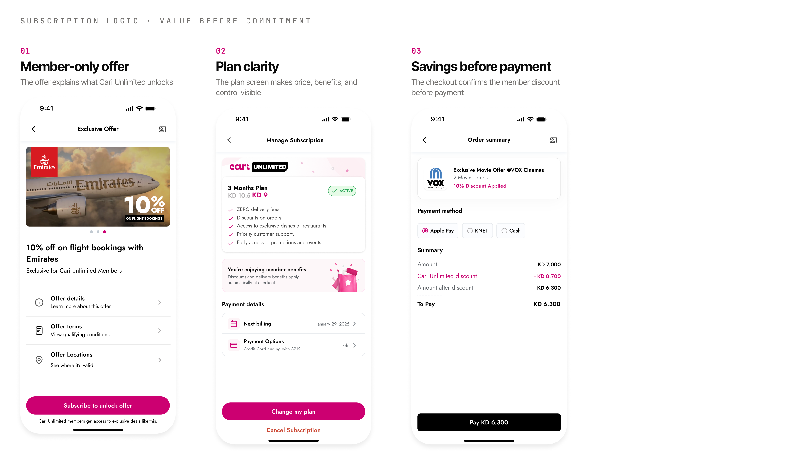
The value had to be understood before the user reached payment.
A subscription flow fails if users only see a price without understanding what they get back. The main design decision was to bring the value explanation forward: benefits first, savings made concrete, plan commitment last.
I structured the flow around delivery savings and repeated-order value before asking the user to commit. The aim was to make the subscription feel practical, not like an upsell pushed at checkout.
Plan screen
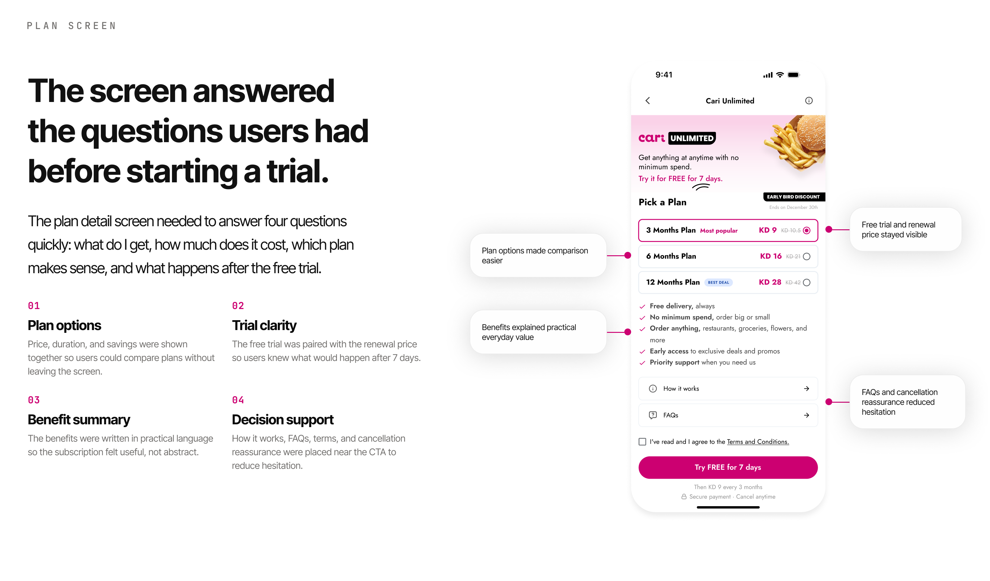
The screen answered the questions users had before starting a trial.
The plan detail screen needed to answer the user's basic questions quickly: what do I get, how much does it cost, when does it apply, and why is it worth it.
I used a compact hierarchy with price, key benefits, trial details, and decision support so the user could understand the plan before starting it.
Entry points
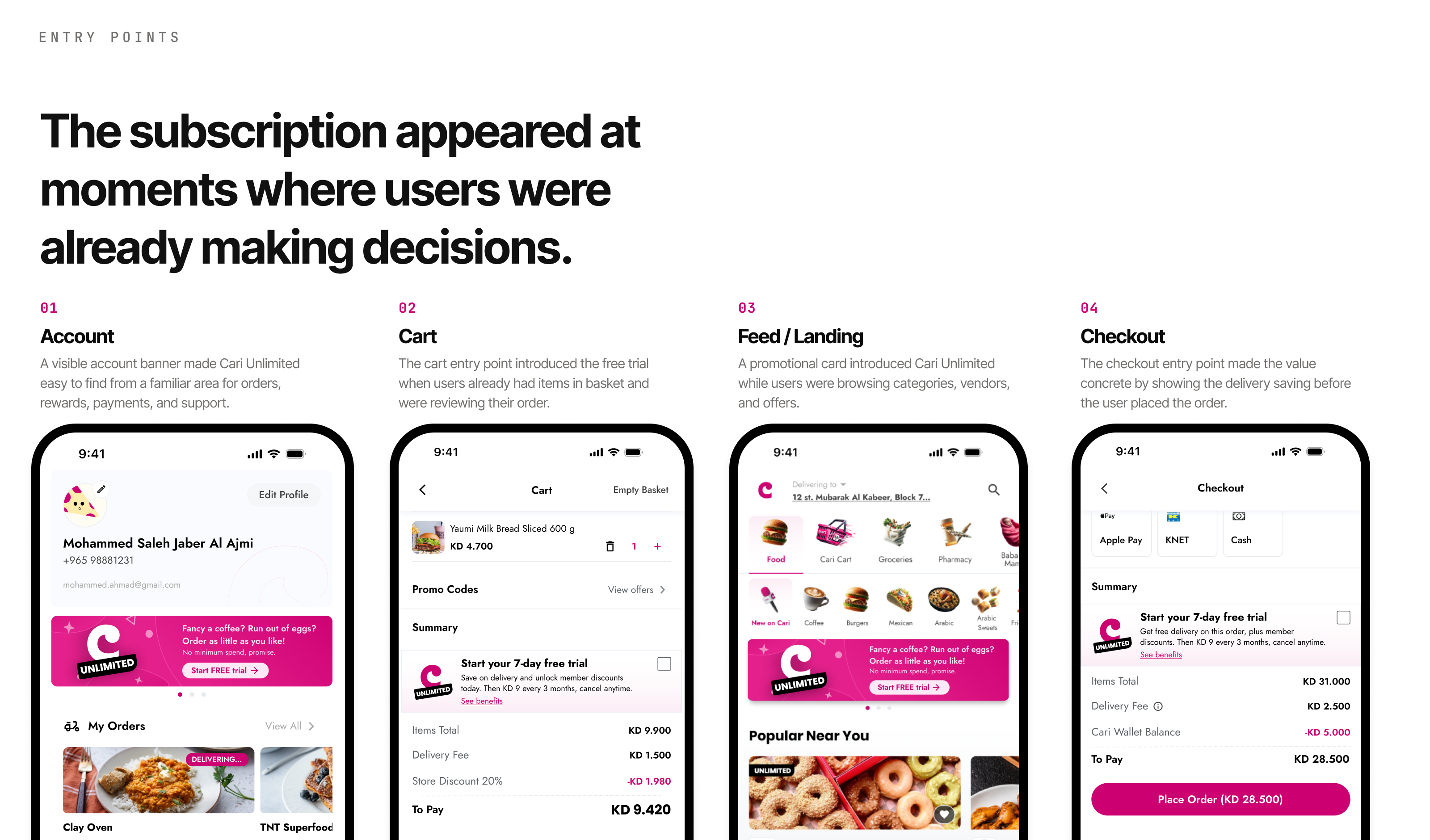
Subscription entry points were placed where intent was already high.
Instead of relying only on a standalone subscription page, the experience needed to appear in places where users were already thinking about delivery fees, repeat orders, or checkout value.
I explored entry points across checkout, account, promotional cards, and plan detail screens so the feature could be discovered without interrupting the core order journey.
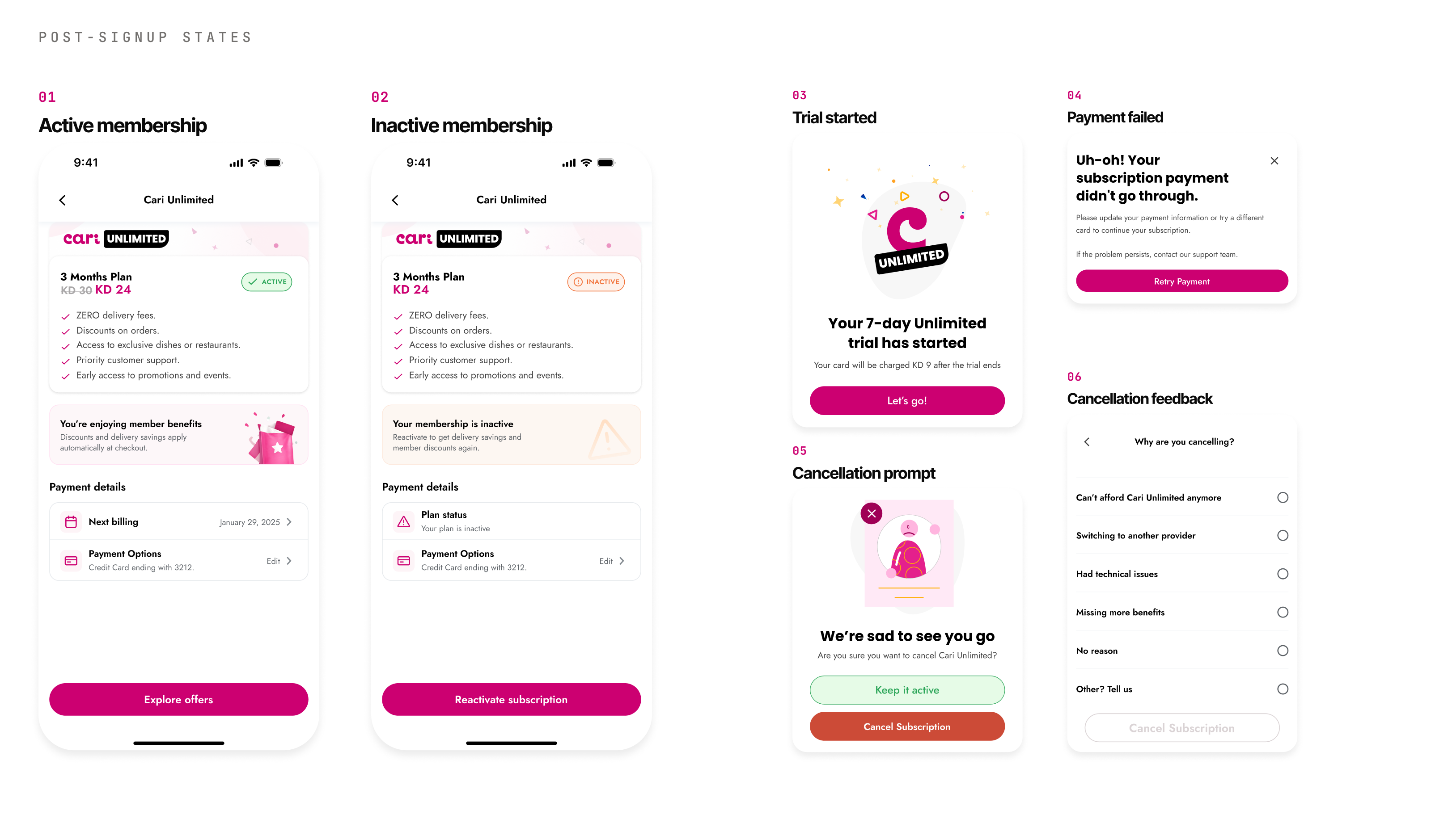
Post-signup states
The subscription needed clear states after signup.
After subscribing, users needed to know whether their membership was active, what benefits were available, and what to do when something changed.
The experience needed to handle active use, inactive status, trial start, payment recovery, and cancellation without leaving users guessing.
Impact
What this case shows.
This case shows subscription thinking inside a live marketplace product. The work was not only about creating a plan page. It was about placing the subscription around user intent, explaining value clearly, and supporting the state changes that happen before and after signup.
Subscription UX is not just a paywall. The strongest version of Cari Unlimited treated the subscription as part of the ordering system, not a separate marketing feature pushed at the wrong moment.