Cari · Design Systems · 2022 to Present
Cari was growing fast. The design foundation had to keep up.
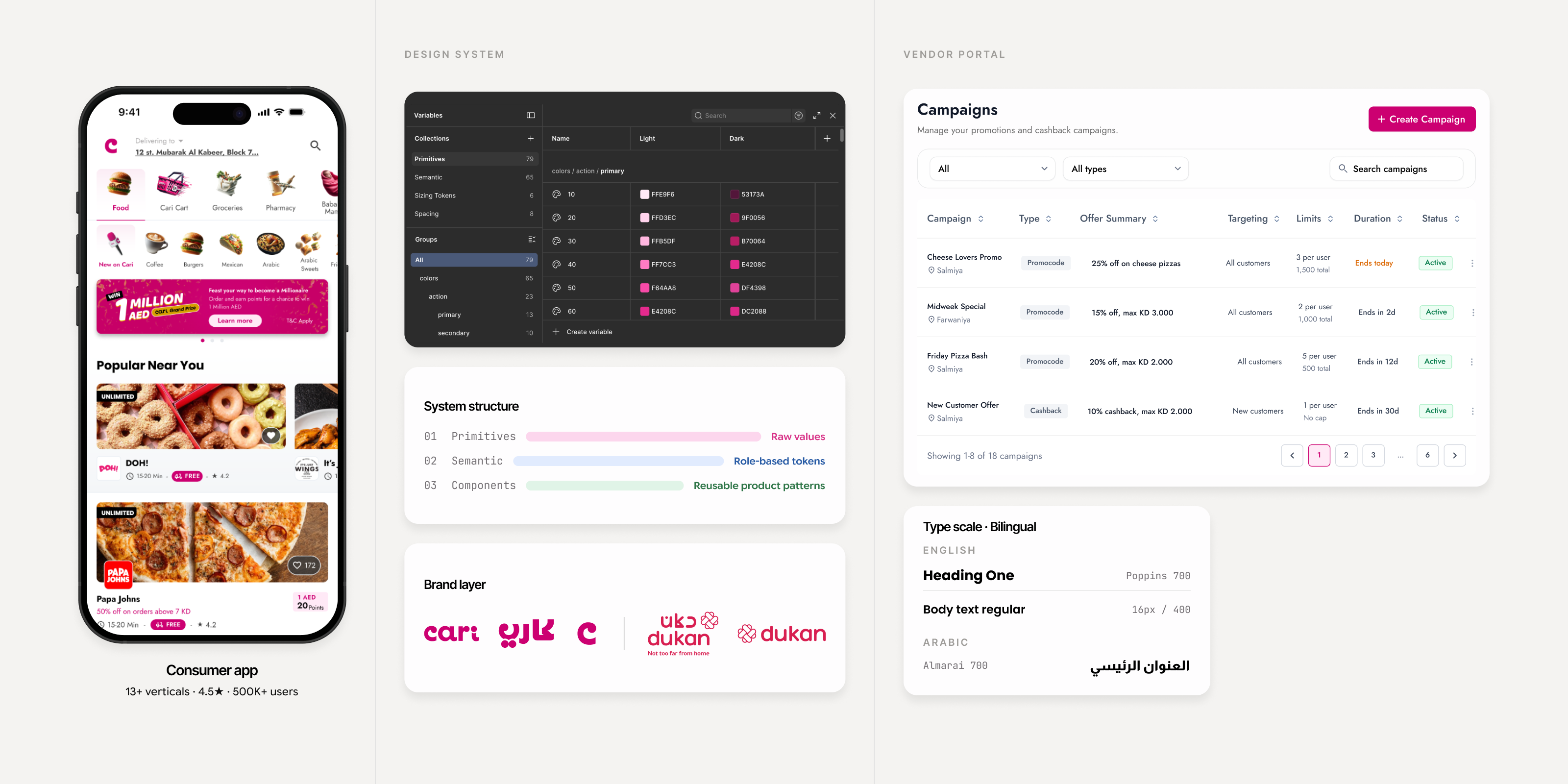
Cari started as a food delivery app within The Taken Seat’s venture-building environment, but it quickly grew into a platform with 13+ verticals, vendor tools, internal operations, and support for English and Arabic.
I led the design system direction and maintained the foundation while the product was moving, with support from another product designer. The goal was simple: stop the same decisions being made again and again across different screens, teams, and product surfaces.
Context
As Cari expanded, I needed one place for the decisions that kept repeating across screens, tools, teams, and languages.
Core system decision
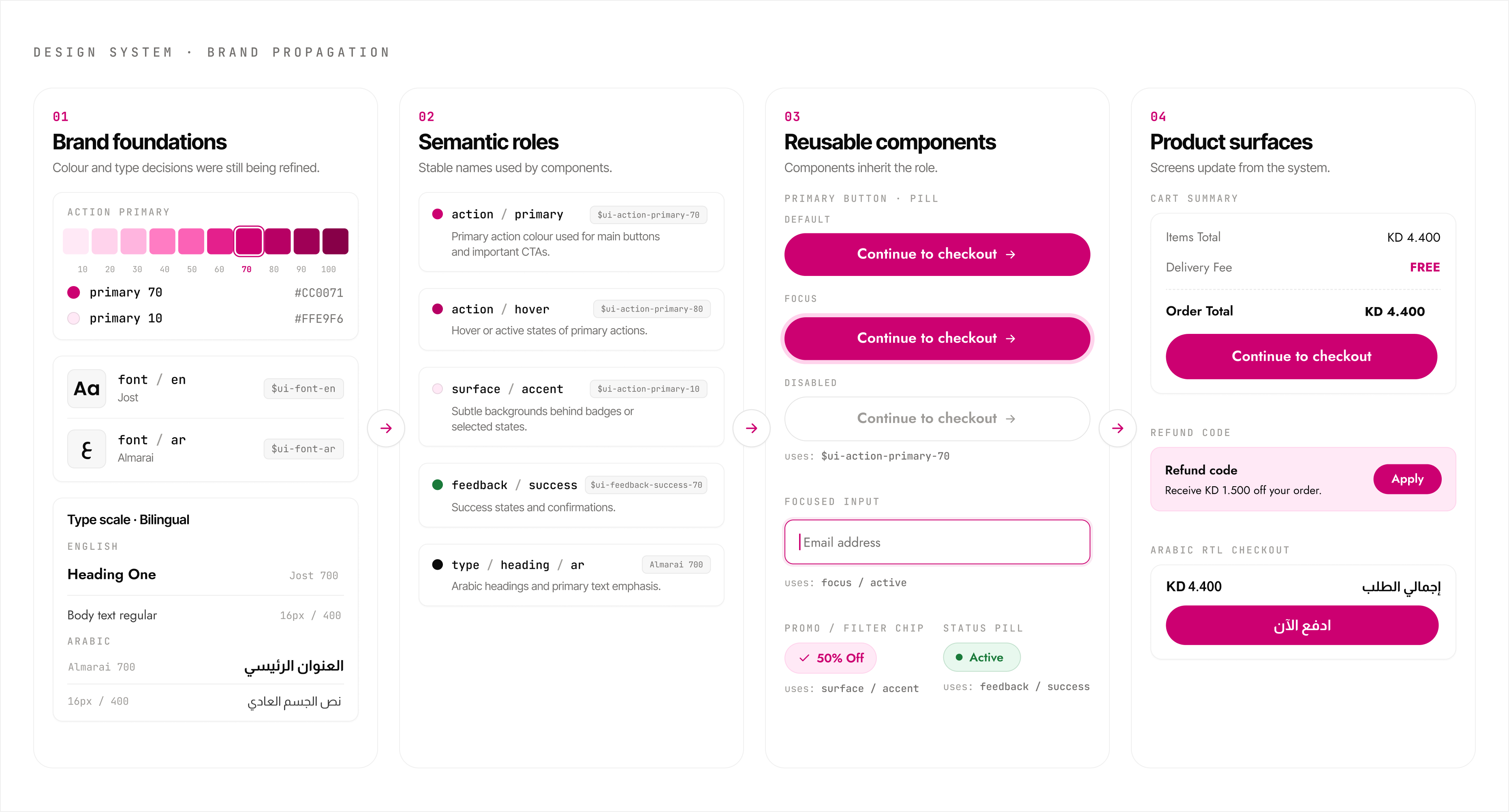
Brand updates needed one place to flow from.
Cari’s brand was still being shaped while product screens were already moving. Marketing and the founders were testing colours and typography across app screens, outdoor placements, and other media.
After a few colour tweaks created screen-by-screen rework, I moved brand decisions into the system layer so later updates could flow through tokens, components, and product screens from one place.
Proof 01
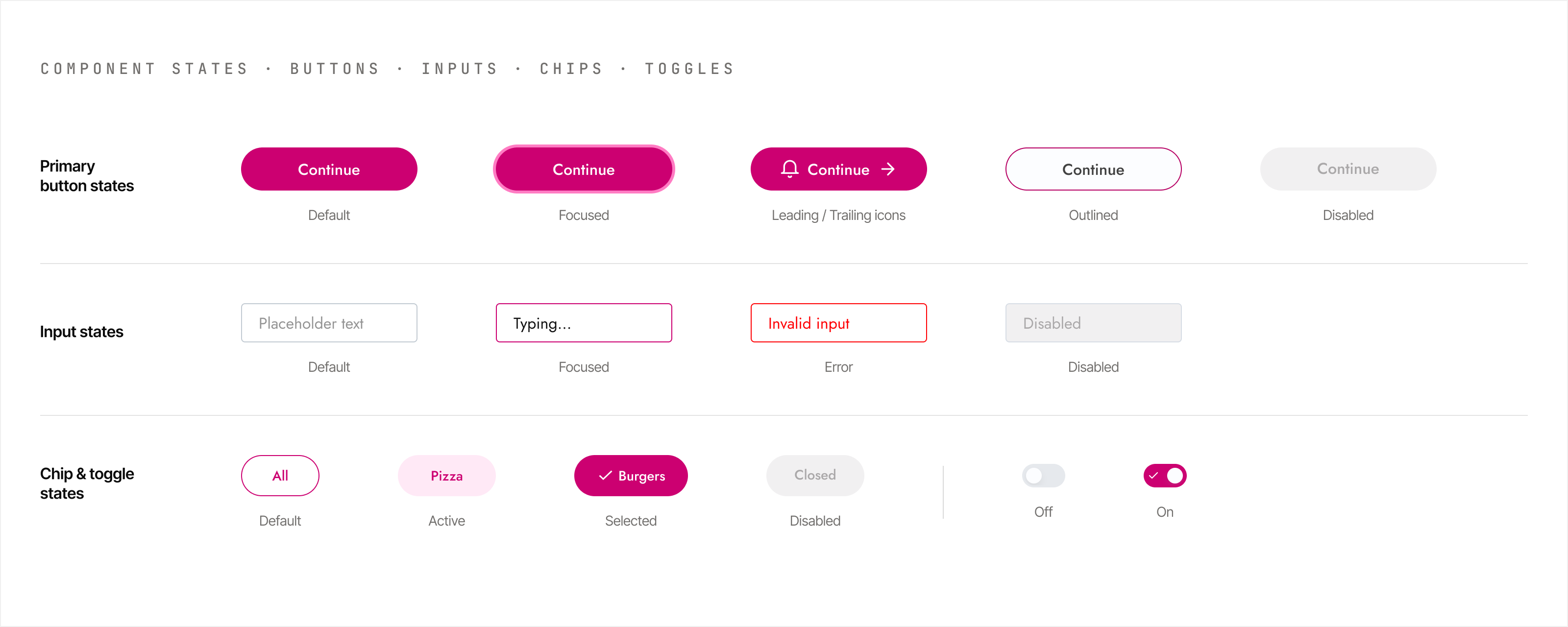
Component states were defined before handoff.
Buttons, inputs, chips, and controls carried their key states in the shared library, not inside individual screens.
Engineers could inspect the expected behaviour in Figma before implementation, including default, focus, loading, error, and disabled states.
Proof 02
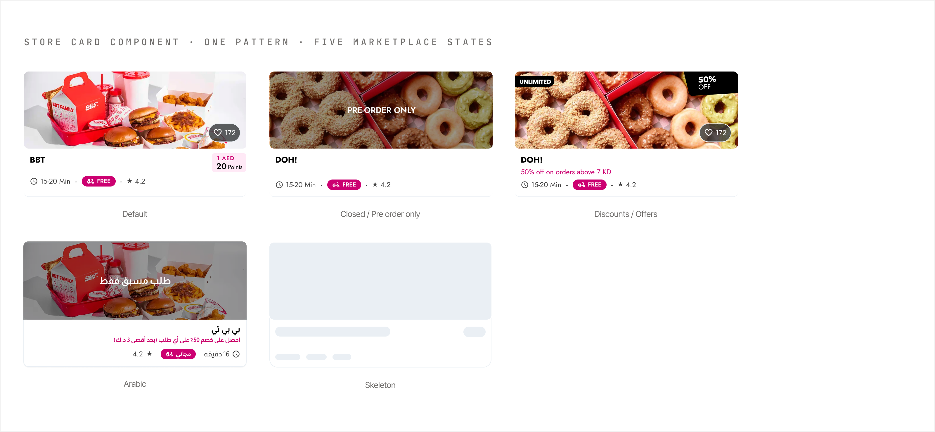
The store card became a shared marketplace pattern.
The store card appeared across the homepage, category pages, search, reorder, offer placements, and Arabic surfaces.
I turned it into a flexible system component so repeated marketplace states could be handled once and reused across surfaces.
Proof 03
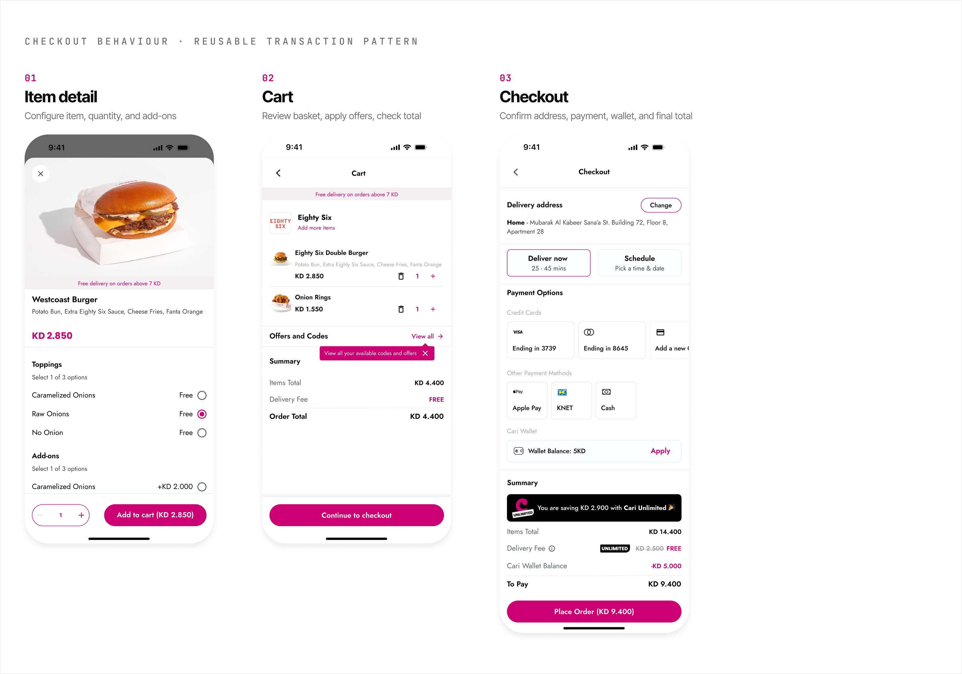
Checkout states were treated as one reusable behaviour pattern.
Checkout touched several high-risk states: item options, basket changes, offers, wallet balance, payment methods, delivery timing, and final confirmation.
I documented these as one reusable transaction pattern so future checkout improvements could reuse the same behaviour instead of redesigning each step from scratch.
How the team used it
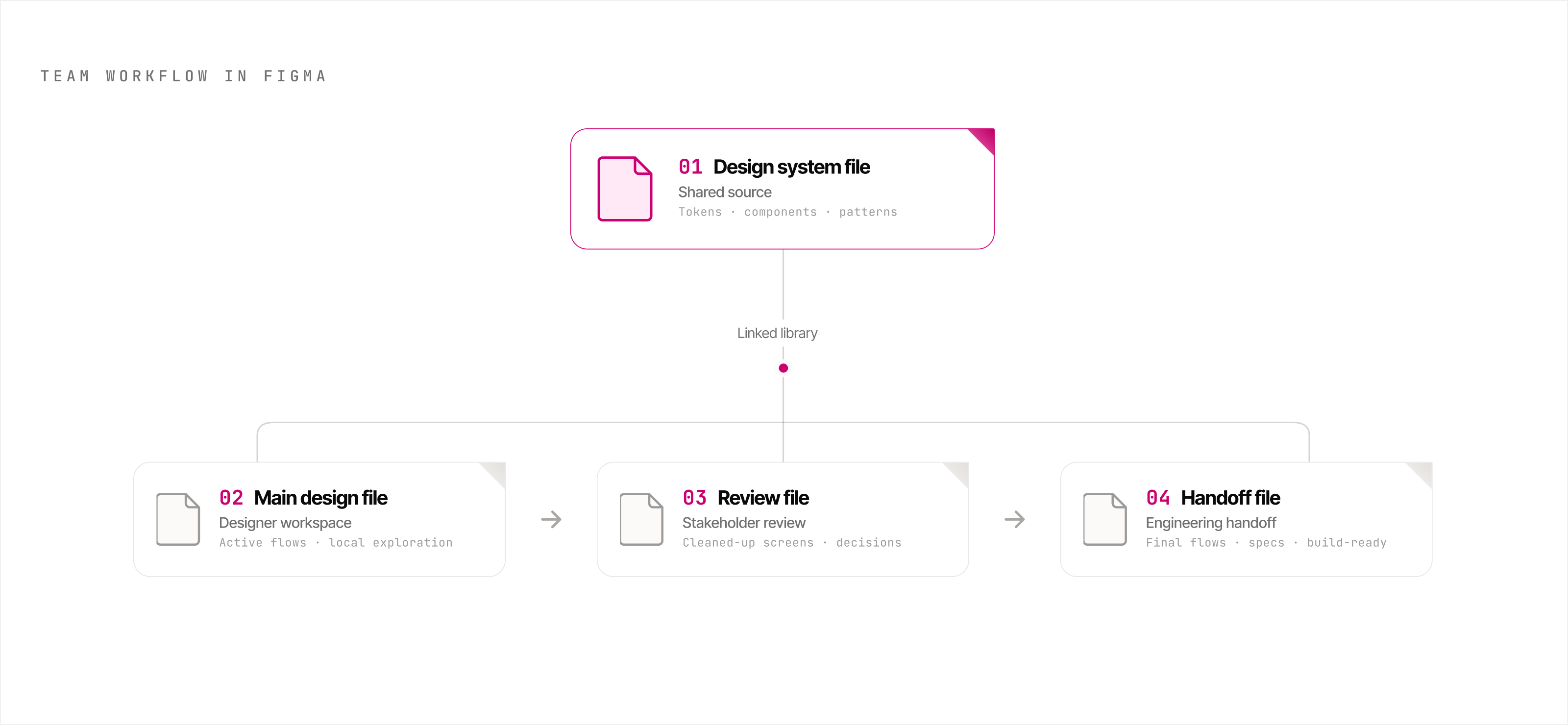
The system worked because each file had a clear job.
Active product design did not happen in the same file used for stakeholder review or engineering handoff. I kept the work split across clear Figma files so each audience had the right level of detail.
Designers worked in the main design file, product managers and founders reviewed cleaned-up work in a review file, engineers received finalised flows through a handoff file, and the design system file stayed linked as the shared source for components, tokens, and patterns.
Validation
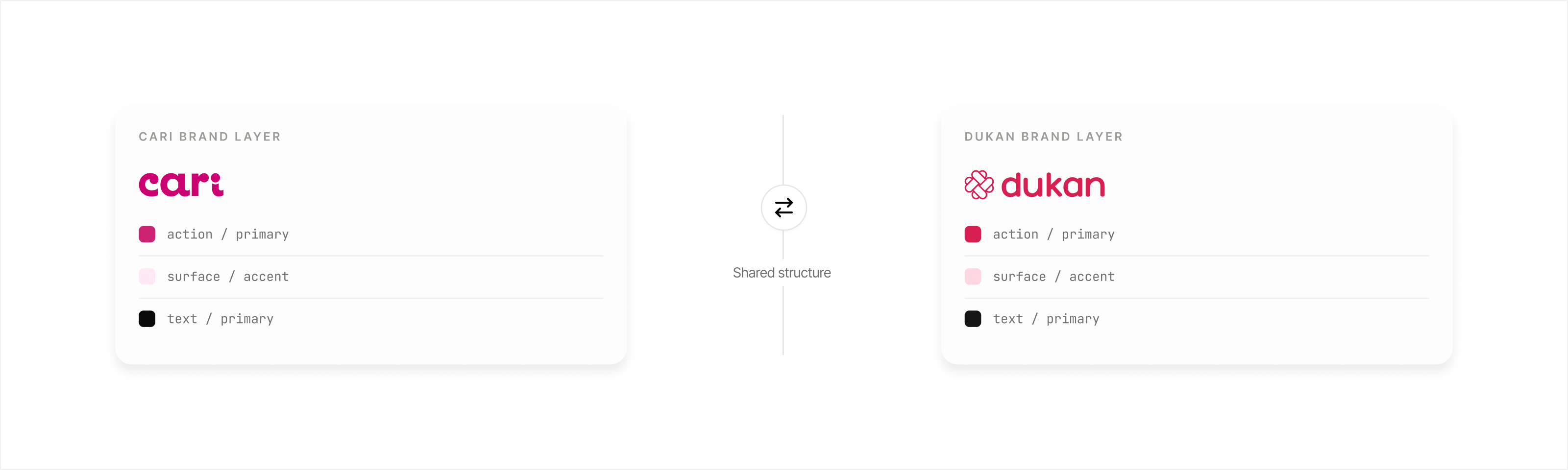
Dukan later proved the system could support another brand.
Dukan was another product under the same venture-building environment. It had its own grocery and food delivery positioning, separate brand, and different product needs.
The product had started from a white-label setup with weak file structure and limited handover, so the team was often working from screenshots instead of a clean design foundation.
Because the Cari system had been built around modular roles rather than fixed brand values, I saw that the same structure could support Dukan too. The brand layer changed, but the component logic, token hierarchy, and reusable patterns did not need to be rebuilt from scratch.
Impact
What the system changed.
The value was not the number of components. It was giving product, design, and engineering a shared way to make repeated interface decisions.
Cari could scale across product surfaces, languages, and brand changes without every team solving the same UI problems again.